Local Artist Max Mattei Photographs the Alphabet in Boston
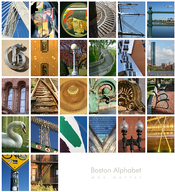 Boston from A to Z in “Boston Alphabet” by Max Mattei. See anything familiar?
Artist Max Mattei, a Massachusetts native who currently resides in Plymouth, has recently stirred up some art buzz with two works—one, a project completed this past summer titled “Cape Cod Alphabet,” and the other, a more recent piece titled “Boston Alphabet.” While his creations are not all based on an ABC theme, he has certainly stood out for having found objects, both natural and manmade, within each respective area to represent the letters of the alphabet. In his Boston edition, the A is represented by a photo of the Zakim Bunker Hill Memorial Bridge, the L by the John Hancock Tower and the Charles River beneath it, the T by stadium lights at Fenway Park, and the Z by the stairs outside a characteristic brick building.
Mattei, who attended the Art Institute of Boston for graphic design and found his knack for photography a few years ago, talked to us about his inspiration for these projects and where his art might take him next.
What drew you to your career in art?
From a very young age I was drawn to music and visual art and found that they both provided me a broader platform to communicate with others in a way I wasn’t able to with words. Playing drums or creating illustrations and drawings seemed an easy and natural way for me to express myself, a voice for my inner thoughts and feelings, without the awkwardness of words. There is always a soundtrack in my head that accompanies [my] work, sometimes real and sometimes just triggered by the music of the world around me: the wind, the surf, the [birds].
What would you call your most successful piece and why?
It is hard to say what my most successful piece has been as I am continually selling a really diverse selection of work at any given time. I would have to say, however, that the “Alphabet” prints have received a great deal of interest and attention due to the very unique nature of the finished pieces. They were an incredible labor of love, patience, and time and I believe they come across that way when seen.
What brought you to create the “Cape Cod Alphabet”? How did you go about doing it and how long did it take?
[My wife] suggested that we take some time to explore and enjoy what was in our own backyard, a place that people from all over the world come to see: Cape Cod. I was incredibly moved by the singular beauty [of each town, and] I was greedy to translate these images into photographs. I began to research the history of the towns, the lighthouses, the beaches, the dunes, and more. I tracked the tides, sunrises, and sunsets and found that each time we would visit, the landscape would alter itself. An idea grew in me that I wanted to create a narrative of sorts. Looking over a few of my photos, I noticed that I could see letterforms and thought how cool it could be, if done right, to create an ABC of the Cape, a kind of cohesive series of images that would tell the story in a more controlled way. It was vital to me that none of the pictures be set up or contrived, but only shot in their natural unaltered state, seen through my camera lens in an interpretive way, sometimes just “suggesting” the actual letter. This literally took months, hours on end combing the Cape, and hundreds of pictures to achieve.
What inspired you to later create the Boston alphabet piece?
It was natural for me to translate my alphabet idea into a city version, and Boston was my obvious choice. [Its] rich history, culture, arts and entertainment, cuisine, sports, diversity, and many different areas, each with their own indelible stamp, provided me with [many] choices. That alone presented a tremendous challenge. [Where as] the Cape was quieter with less distractions and obstacles, the city had a heartbeat and rhythm that at times prevented me from snapping a shot I really wanted when I wanted it, so I really had to be creative and work around that. My formula was the same; to only interpret the images that existed and not alter them in any way. It did take me longer to complete this print, but the overall process was similar as to my design and layout and the desire to deliver a narrative to the viewer.
Are you planning on creating more alphabet pieces for different cities?
I will not be doing any more alphabet pieces at this time, although I have learned to never say never. My work and focus is always changing and moving in directions that sometimes are unexpected, even to me. I don’t want to get stuck in a niche or be known as “the guy who does those alphabet pictures.” I loved creating them, but they are done and it’s time to welcome new directions.
What are you working on right now, and where do you hope to take your career in the future?
I’m currently exploring photography more as fine art and delving into creating pictures that combine my “inner space” as an artist with the images that move me to snap that shot and tell a story.
I don’t really think of my love for photography so much as a career but really more of a calling. It seems to have evolved with a pulse of its own and I most often feel it is not so much where I want to take it as where it’s going to take me.
Max Mattei works as a freelance graphic designer and photographer. His work has been displayed in several galleries, including The Artful Hand Gallery in Chatham and Dennis, Tree's Place Gallery in Orleans, Windemere in Plymouth, Splash in Sandwich, and more. Mattei's work can be viewed at maxmatteiphoto.com, and he can be reached via email at maxdesign@comcast.net or call 508-759-6979.