Boston’s Education Gap, Visualized

Photo via iStock/janniswerner
Boston is arguably the greatest college town in America. The so-called “Athens of America” is consistently ranked among the smartest cities in the United States, and it’s long been a bastion of the liberal academic elite—for better or worse.
But contrary to popular belief, not everyone in Boston walks around clutching their diplomas while spouting off about dialectical materialism.
Texas Christian University geography professor and expert cartographer Kyle Walker created an interactive visualization showing the contrast in education levels in major U.S. cities. In Boston, the segregation of those with degrees and those without is clearly visible by neighborhood.
In Walker’s map, each dot represents between 25 and 500 people, depending on the level of zoom. The colors correspond with highest level of education attained: blue for graduate degrees, green for bachelor’s, yellow for some college, orange for high school, and red for less than high school.
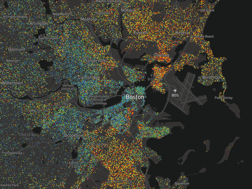
Map by Kyle Walker, TCU Center for Urban Studies
The map shows high concentrations of blue and green dots in the Back Bay, Fenway, and Jamaica Plain, and red, orange, and yellow dots in Roxbury, Dorchester, and East Boston.
“In one aspect, this map speaks to national discussions around social and political polarization between metropolitan and rural areas. Bachelor’s and graduate degree holders tend to cluster in cities, as opposed to rural areas where a high school education is more common,” Walker says. “However, within metropolitan areas, the map also reflects the achievement gap that is associated with racial and economic segregation. In many cases, neighborhood-to-neighborhood differences are quite distinct.”
You can check out Walker’s full map here.