One-Bedroom Rent MBTA Map Shows Huge Differences
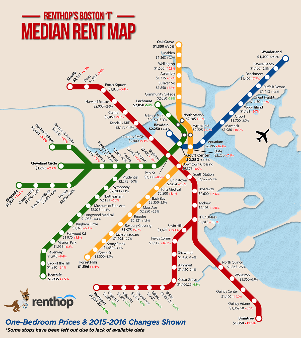
Map by RentHop. CLICK TO ENLARGE
The criteria for apartment hunters in the city usually revolve around two main factors: price and proximity to public transit.
In a new analysis, apartment rental search engine RentHop combined the two factors and visualized them on an MBTA map. By looking at apartment listings within about a third of a mile of each T stop, RentHop created a graphic that shows the median rent for one-bedroom apartments at every stop.
The rent map shows huge differences, both in prices between each stop and in prices compared to last year. For example, choosing to live at either Broadway or Andrew on the Red Line is a $400 difference in rent—Broadway’s median rent clocks in at $2,600, whereas Andrew’s is $2,195. Skip down one more stop to JFK/UMass and a one-bedroom goes for $1,813. That’s an $800 difference from Broadway. Similarly, median rent at Aquarium on the Blue Line is $2,295. Choose to live across the harbor at Maverick and you’ll save about $300 a month.
Percentages on the map show how median one-bedroom rent has changed since 2015. It’s 9 percent more expensive to live in Central Square this year (making it pricier than Harvard Square) and 18 percent more expensive to live at Savin Hill. The largest jump in price is at Riverside, where the median rent has increased a whopping 22 percent.
On the other hand, some stops decreased in price—Community College, Lechmere, Mattapan, and Butler are all more than 5 percent cheaper than last year.
While it’s no surprise that T stops and rent prices are correlated, it turns out a difference in a few stops can lead to huge savings.