Behind the Design: What Could Have Been at Bondir, Trina's Starlight Lounge
Welcome to Behind the Design, a series where local blogger Charlotte Wilder explores the thought behind the design of restaurants. Because, after all, the visuals are just as important as the food in the dining experience.
Last week, I wrote about the inspiration boards that Oat Creative Director Jennifer Lucey-Brzoza put together for Island Creek Oyster Bar and Saloon. This week, check out some unused logo prototypes Lucey-Brzoza came up for clients Bondir and Trina’s Starlight Lounge. “There’s all this work we do that never gets seen — the final product is all that makes it out,” says Lucey-Brzoza. Ahead, learn about the thought process behind these logos, and why the ones that didn’t get picked, well, didn’t get picked.
Bondir:

When chef/owner Jason Bond came to Lucey-Brzoza for branding and design, he already knew the restaurant would be called Bondir, the verb for “to jump” in French. “I started thinking of jumping, and then a rabbit, which fit perfectly into French cuisine,” says Lucey-Brzoza. “So I ran with that, the whole rabbit concept; it’s unusual for me to run with something as opposed to spending a lot of time researching and finding inspiration,” she continued, “but in this case, I went with it.”

Lucey-Brzoza says of this mock-up that “the white rabbit was a little much,” and felt too much like Alice in Wonderland. “I think once the rabbit was rendered they realized it wasn’t the direction they wanted to go, and they also wanted the type to be more undefined; they felt the type of the other two had too much of a French bistro look,” Lucey-Brzoza says.

Above is the logo the owners ultimately chose. Lucey-Brzoza drew the font by hand, then scanned it onto the computer and refined it. “They chose the text-based logo for its handmade quality and abstractness. It’s supposed to feel like it’s jumping,” she says, “and this is taking it really far, but it feels like rabbit ears to me, with the ‘B’ coming out of the corner of the card like that.”
Trina’s Starlight Lounge:
Trina’s is located in what used to be the Abbey Lounge in Inman Square. “It has so much history,” Lucey-Brzoza says. “It’s such a cool space, that we really wanted to do a fifties-inspired thing.” The owners brought Oat an old picture of a couple dancing in the Abbey Lounge that served as Lucey-Brzoza’s inspiration. “The man was completely rockabilly; he had cigarettes rolled up in his t-shirt. It was so romantic,” she says.
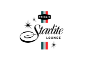
“I got really married to the idea of stars,” Lucey-Brzoza says. She went with a cursive font and some drive-in sign elements to really up the feel of the fifties.

The two logos above were inspired by old cigarette packaging. “The owners felt that some of the other logos looked too much like a national chain of restaurants instead of a singular neighborhood bar,” says Lucey-Brzoza.
 The owners ended up going with the “beer-inspired” logo above. “I think they also really responded to the color of the logo they chose; it all comes down to personal taste and an instinctual response to the work,” Lucey-Brzoza says.
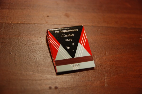
Instead of business cards, the owners of Trina’s wanted matchbooks. Above, what Lucey-Brzoza came up with.
Find more Behind the Design coverage here.
For more online food coverage, find us on Twitter at @ChowderBoston.