‘StereoType’ at BSA Space Pushes the Boundaries of Typography


Tracking, kerning, leading, weight, a proper mix of serifs and sans. Typography is all around you, and in many cases, it’s designed to go more or less unnoticed. Consider the now ubiquitous Helvetica—which helps you navigate the T—and Gotham, “the font that won Obama’s presidency.”
From a functional standpoint, typography is all about legibility, but that’s the last thing the BSA’s new exhibit is concerned with.
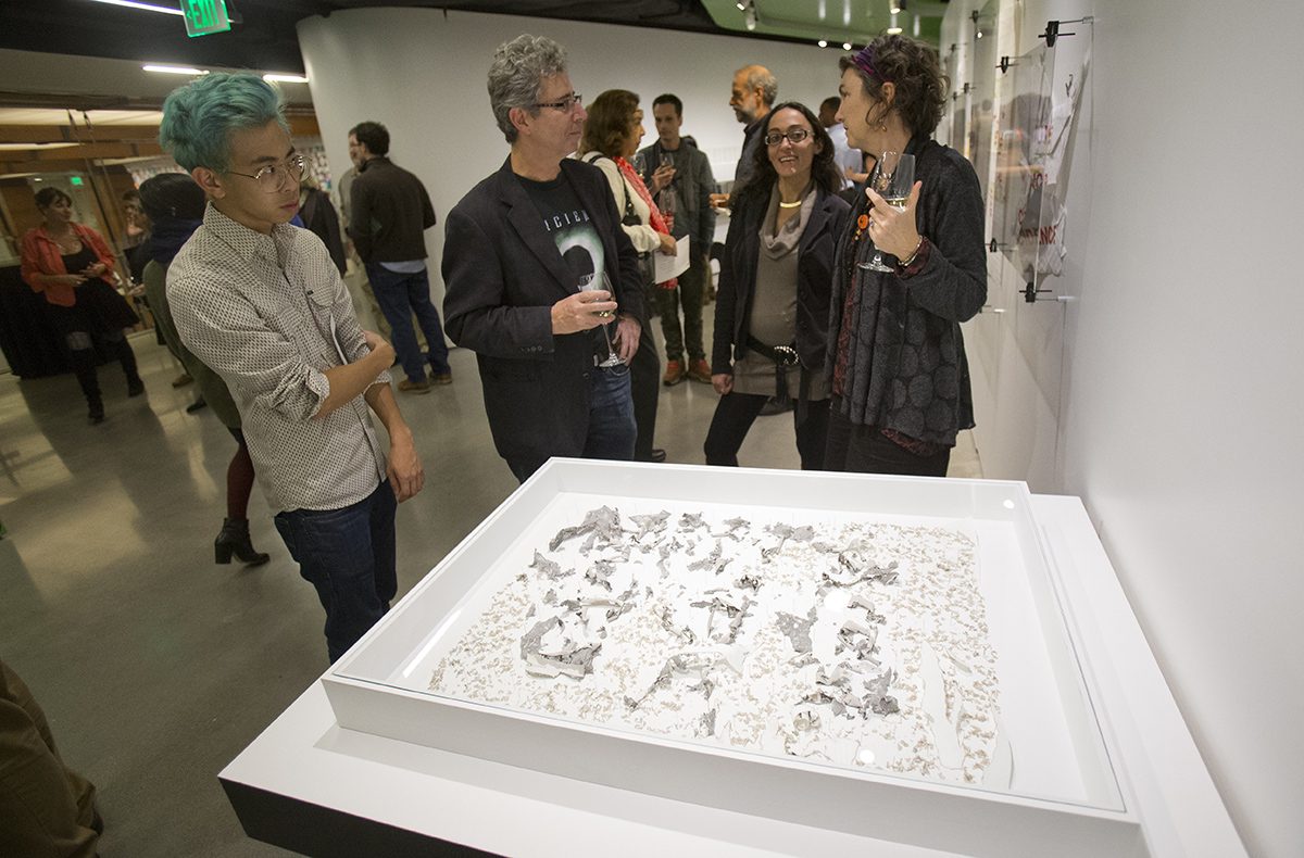
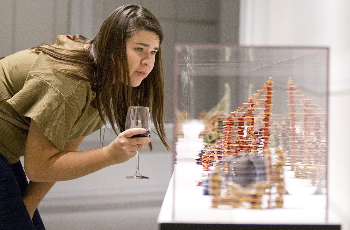
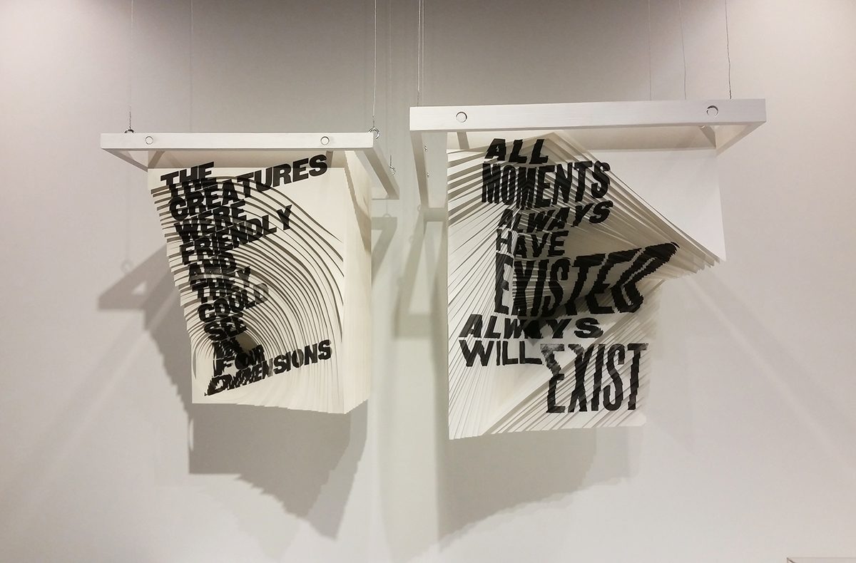
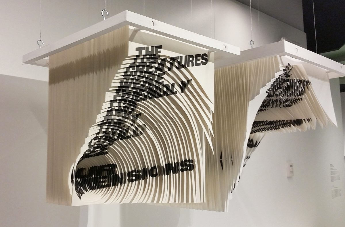
StereoType: New Directions in Typography, which opened Thursday at the BSA Space, features 14 one-of-a-kind works by designers from around the world. Each art piece has something to do with type and merges the practice of typography with other disciplines such as animation, nanoscience, fashion, and even performance art.
StereoType was curated by C2 (CuratorSquared), a partnership between Ginger Gregg Duggan and Judith Hoos Fox, who first conceived of the idea in 2010.
“Ginger identified that there were so many artists and designers from around the world coming from different disciplines—artists, sculptures, architects, scientists, fashion designers—who were really working with the idea of texts and letters, but in a fresh kind of way that was infused with time, space, performance, dimension, actual, and virtual,” Fox said. “We started looking at this phenomenon and knew that it would be a wonderful exhibition.”
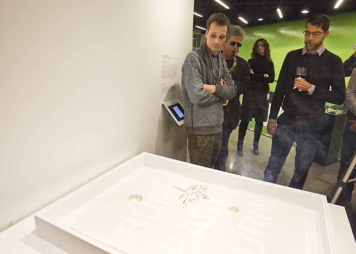
Before the opening gala Thursday, Dutch designer Remco van de Craats of EDHV set his piece on fire. The poster-sized blotting paper did as the text on it instructed, “Burn Baby Burn.” Van de Craats made sure to point out that the phrase was pulled from “Disco Inferno” long before his eight-month-old baby was born.
Van de Craats, whose team also worked on the city branding for Eindhoven, Netherlands, where they are based, was also scheduled to meet with Somerville Mayor Joe Curtatone Friday to talk city branding. “It’s something that’s very important in Europe, and here it’s been very interesting to see Harvard and MIT, which are very well-known brands around the world,” van de Craats said. “And I think there is a lot of potential in Somerville.”
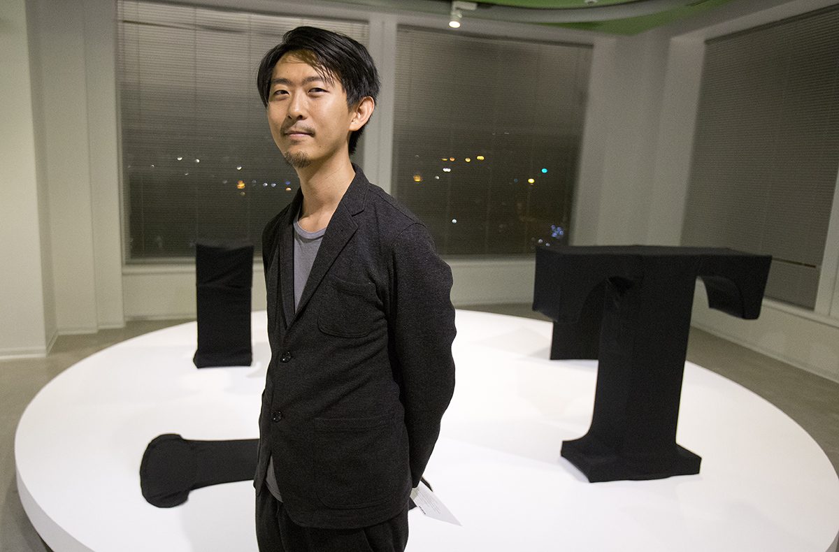
Two other artists in attendance were Masashi Kawamura from Japan and Brian Banton of Canada.
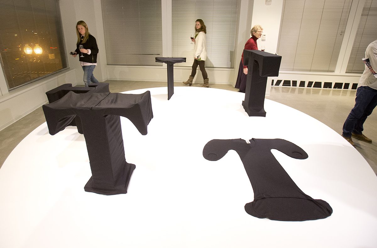
Kawamura’s pieces mix typography with couture. His T-shirts are shaped as five different fonts, and the label even includes the point size that each “T” shirt is set in. For example, the Baskerville T-shirt is sized at 3980 pt, the Courier shirt at 3100 pt, and so on.
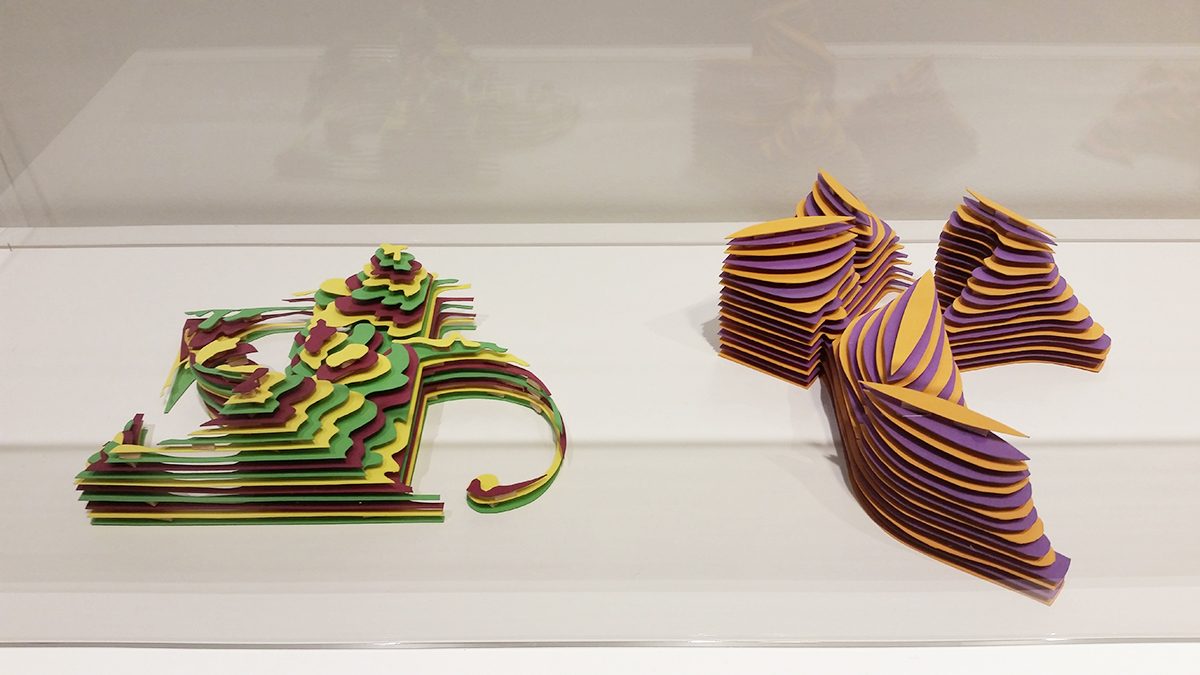
Banton’s exhibit piece is a 3D typeface he named Heterosis. Originally created for his master’s thesis at York University, Banton created each letter by hand, stringing transparent elastic at specific vector points forming curved planes between two pieces of plexiglass. The result: stunning luminescent 3D letters—a “kinetic typeface” you can inspect from all angles.
“I started with pink rope, and at one point tried fishing line,” Banton said. He ultimately used the clear elastic, which required drilling tiny holes into the plexiglass to pull each line through. “I’m just honored to be a part of this group,” Banton said, citing New York-based designer Stefan Sagmeister—whose work also appears in StereoType—as someone he’d love to work for one day.
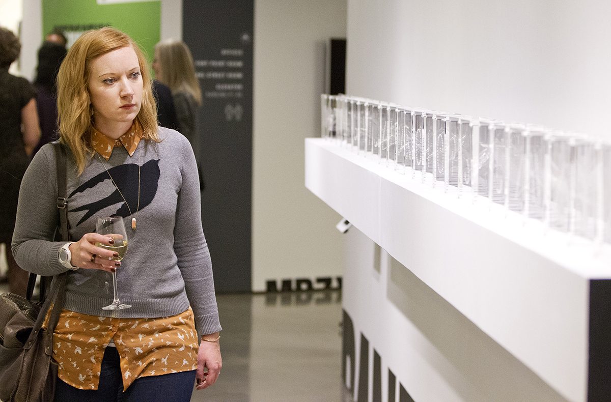
Other standout pieces in the exhibit include hand-cut prints by Alida Sayer, who “carves out” messages into layers of letterpress prints; a video installation by Song Hyun Ju that rewards viewers who stick around to see words form out of fragmented pieces flying across three screens; and Thomas G. Mason’s LithoPartical Dispersions: Colloidal Alphabet Soup, which projects a live video feed of microscopic letters onto the floor. Aside from just being super-cool, someday this nano-type could be used to label cellular structures.
All 14 works in the exhibit challenge how we interpret type. If a typeface isn’t legible, should we still call it one? Stop by the BSA Space and decide for yourself.
StereoType: New Directions in Typography will be on view at BSA Space until May 25, 2015. Free and open to the public, 290 Congress St., Boston, architects.org.