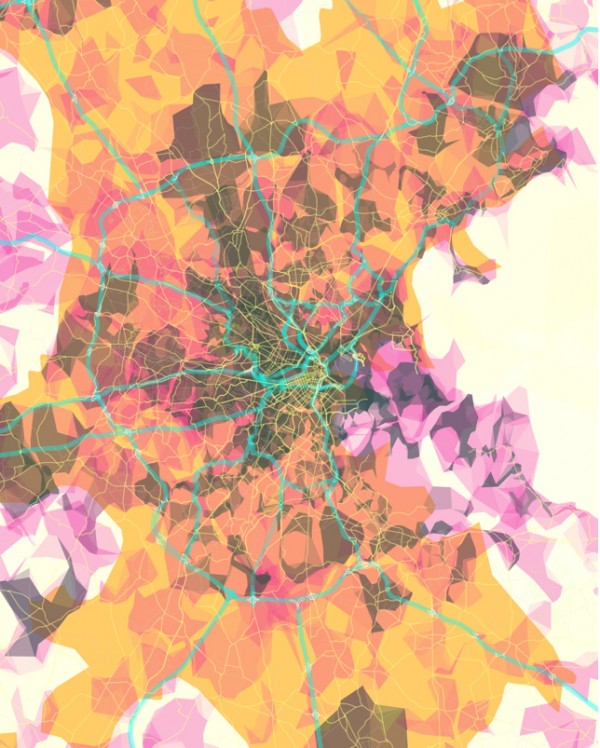
Eye Candy: Pretty Maps Boston
Forget the clichés of the Boston skyline from across the Charles. This season’s most wall-worthy treatment of Boston is the Pretty Maps series by programmer/artist Aaron Straup Cope over at 20×200.
A couple of summers ago when Stamen Design’s Pretty Maps first made its way around the web, everyone oohed and ahhed because of its Google Earth-like addictability and visual appeal. Behind the scenes, it’s pretty cool, too: The interactive mapping tool assigns colors and essentially overlaps numerous layers of community-generated data, including Flickr shapefiles, Natural Earth urban areas, and OpenStreetMap (OSM) road, highway and path data.
The resulting image looks like you’re flying above the city while looking through a kaleidoscope, or like this:
I asked Cope, a Montreal native who’s living in San Fransisco, why he selected Boston for the series: “From an aesthetic point of view, [Boston] has a beautiful shape,” he said. “The map seems kind of impenetrable at first, but ultimately, it comes down to the composition.”
Other cities in the 20×200 series include Chicago, Dallas, D.C./Baltimore, Hong Kong, Paris, New York City, Los Angeles, and San Francisco. Or, you can check out locations that didn’t make it to print in the online interactive map.
Maybe I’m partial, but Boston really is a true beaut. (OK, Paris is pretty sweet, too.)


