
Are These the Ugliest Uniforms of All Time?
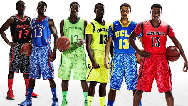
On Thursday, Adidas revealed a new series of college basketball uniforms. The Internet’s reaction to the neon-colored, Zubaz-like monstrosities, which will be worn by Baylor, Cincinnati, Kansas, Louisville, Notre Dame, and UCLA, was swift and decisive. Everybody thinks they’re ugly. “Awful,” “Repugnant,” “Unsightly,” and “Preposterous,” are just a few ways the headline writers decided to describe these things. It’s as if Adidas specifically designed them to be worn at a black light party.
Their “hideousness” is unprecedented, although around here, we’ve had to cope with some fairly gross uniforms over the years. So, here’s a brief anti-tribute to some of the most unattractive laundry in Boston sports history.
The worst jersey in Boston sports history? That’s easy. The third sweater the Bruins wore from 1995 to 2006. It was yellow, it had weird jagged border stripes, and worst of all, its giant logo—which presumably was meant to resemble a grizzly—looked like a smeared blob. On television, it was nearly impossible to recognize that it was a bear’s head. A hockey writer I know said that his dad once took a glimpse of it and said, “That’s a pile of,” well, you get the point.
In the ’90s, when they to switched from Pat Patriot to the Flying Elvis logo, the Patriots experimented with a few different uniform combinations. The jersey they wore from 1995 to 1999 was the worst of the bunch. I remember several announcers saying it reminded them of something you’d see in the World League. (This was before it became NFL Europe.) It looked like a teenager designed it in Paint Shop. It had vertical stripes, diagonal logos on the shoulders, and shadowed numbers.
The Red Sox and Celtics haven’t changed too much about their uniforms over the years. The C’s recently added a black-and-green third jersey. It’s not exactly ugly, but anything that strays from the classic green and white will rile up some traditionalists. In 2008, the Red Sox tweaked their road uniforms. The newest version features a dark blue typeface instead of red. Like all uniform changes, it gave the Red Sox a chance to sell more stuff. That’s what Adidas is banking on this month, even if their new product is ugly as hell.

