This Redesigned Cambridge Victorian Looks Magical in Monochrome
Walker Architects blends Victorian charm with a little edge.
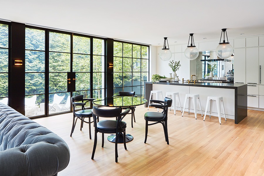
The open-concept kitchen and family room looks out onto a small backyard filled with birches and arborvitae. / Photo by Jane Messinger
The original condition of this Cambridge Victorian generates a charming debate between the current homeowners, Abby and John, who say Abby recognized the house’s potential almost immediately, while John only saw scenes from the 1980s homeowner nightmare The Money Pit. To be fair, they both had points. At 5,000 square feet, the 19th-century house—which previously had been owned by the Catholic Church and carved up into small boarding rooms for priests—teemed with sloping floors, asbestos, knob-and-tube wiring, and brass piping. And yet its antique appeal was undeniable. “It was intact in a lot of ways,” Abby says, with preserved elements such as fireplaces, stained glass, and beautiful millwork. “It still had that sense of history and craft,” she adds. “It just needed some love to bring it back.”
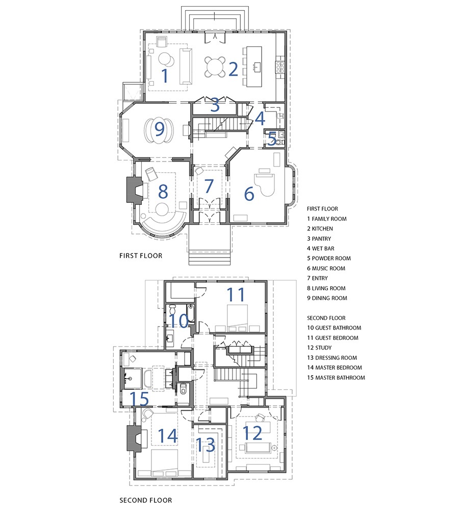
For that, the couple hired Walker Architects, embarking on what would be a nearly six-year project to update and restore the house. Led by architect Brad Walker, the South Boston–based firm took the lead on reconfiguring the floor plans while Abby collaborated with the team on all furnishings and finishes. Their ultimate goal? “A rich blend of authentic historical details and contemporary interiors,” Walker says. “[That’s] what John and Abby were excited about, and what our guiding principle was in both the architecture and the design.”
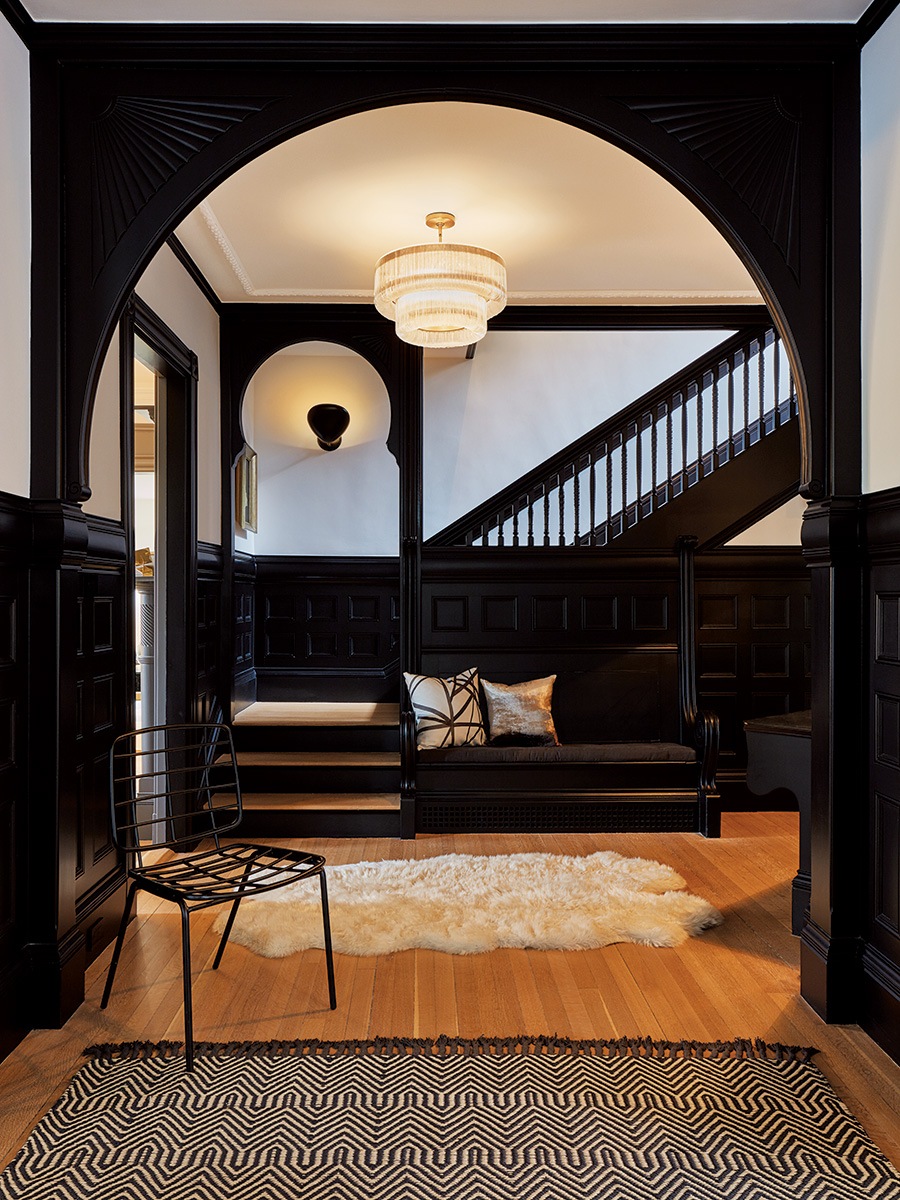
The keyhole arch, wood-paneled walls, and built-in, pew-like seating in the entryway offer subtle nods to the previous owners. / Photo by Jane Messinger
Refinished brass hardware in the entryway warms up the dark millwork. / Photo by Jane Messinger

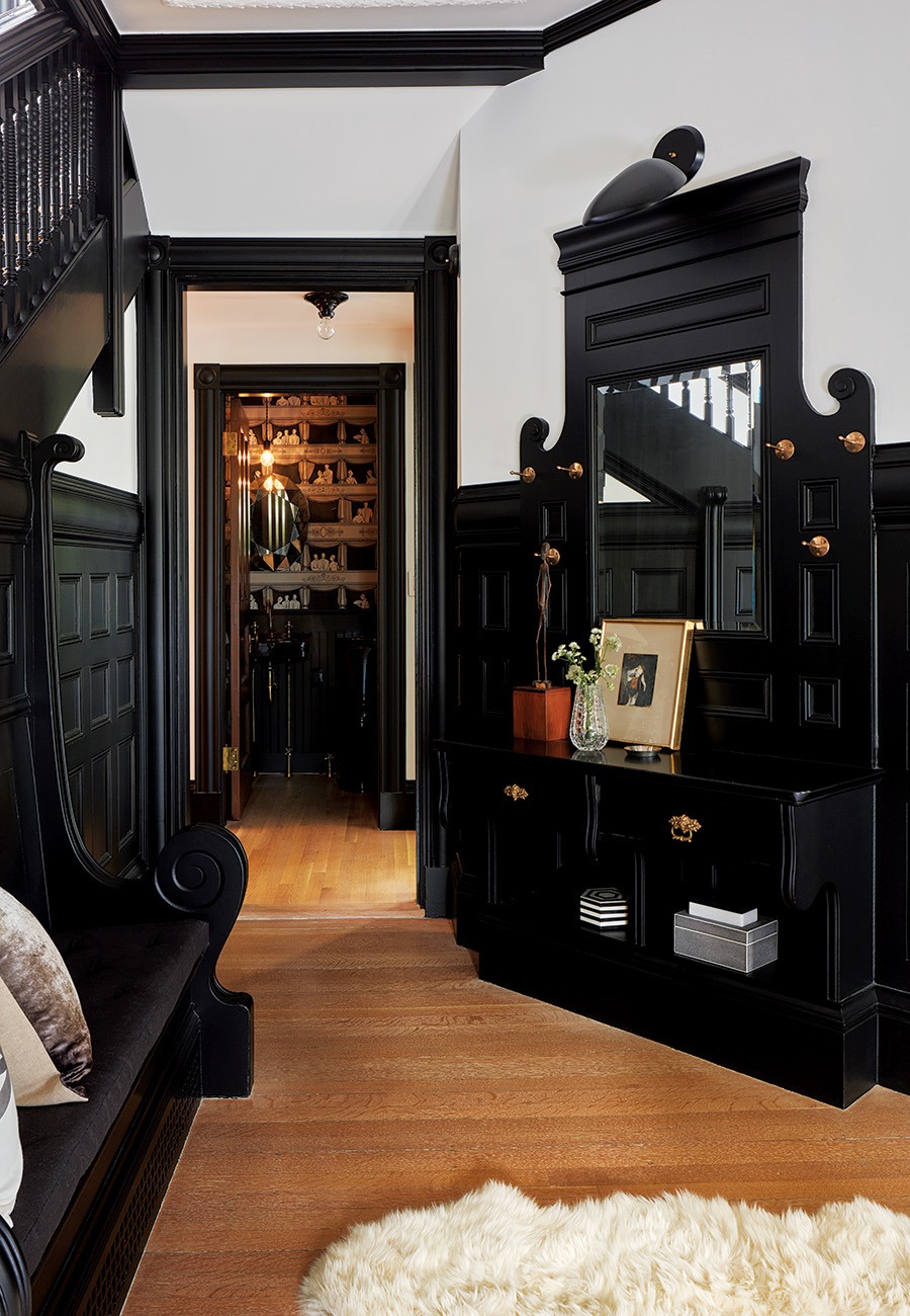
Original to the house, mahogany pocket doors throughout the first floor were carefully refinished to display their true honey-brown color. / Photo by Jane Messinger
Now that the dust from the renovation has settled, journeying through the house’s three floors feels Dante-esque, with each level getting brighter and airier. Stepping foot in the entry, visitors get a first look at the original millwork—a decadent blend of fir, gumwood, and mahogany that continues throughout the first two levels. Its new, almost black hue—courtesy of a fresh coat of paint—pairs well with the mahogany doors the team refinished along with many original brass features. “I think the beauty of the wood gets lost when it’s just a sea of brown,” Abby says. “[Painting it] emphasizes and shows off the millwork in a different way.”
To balance the ornate details in the entry and the adjacent living room, Abby chose to use modern artwork, light fixtures, and furniture throughout the house. Even the dining room, located between the living room and the family room, skews nontraditional. There, John and Abby opted for curved goldenrod-colored couches set up around a bistro-style marble table, where they like to sip cocktails and play backgammon. “They’re young people, and they didn’t want to live in a dowdy Victorian or do the usual, safe thing,” Walker says.

A modern take on a 17th-century still life, a photograph by Paulette Tavormina hangs by the fireplace in the dining room. / Photo by Jane Messinger
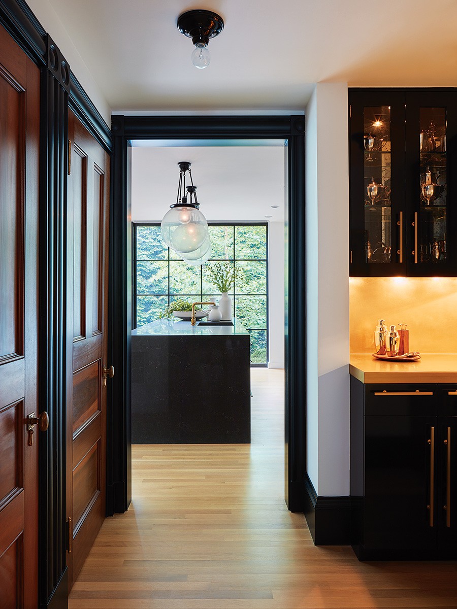
Inspired by the metallic finishes throughout the house, the wet bar’s lighted brass countertop and backsplash exude a warm glow. / Photo by Jane Messinger
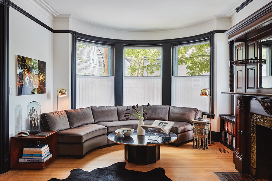
Abby worked in straight-from-the-store finds—like the curved Mitchell Gold + Bob Williams sofa in the living room—in ways that feel custom. “[She] had to have the architects render it to make sure that the radius would work. I don’t know how she does that,” John says. “There’s a lot of stuff that’s not custom but looks like it was made for this house.” / Photo by Jane Messinger
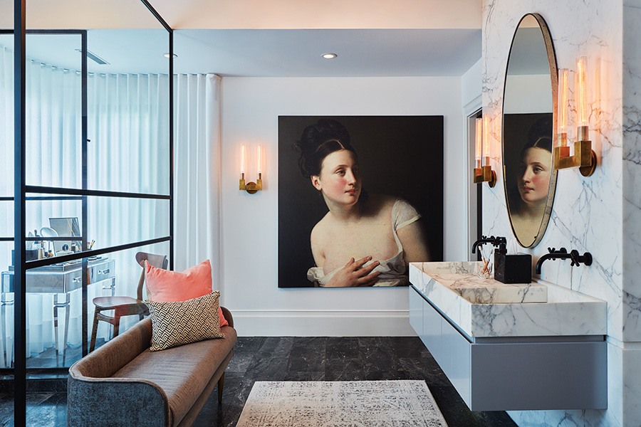
Vast expanses of marble and glass lend a sophisticated air to the master bathroom, where plush seating and an over-the-top chandelier from West Elm feel right at home. / Photo by Jane Messinger
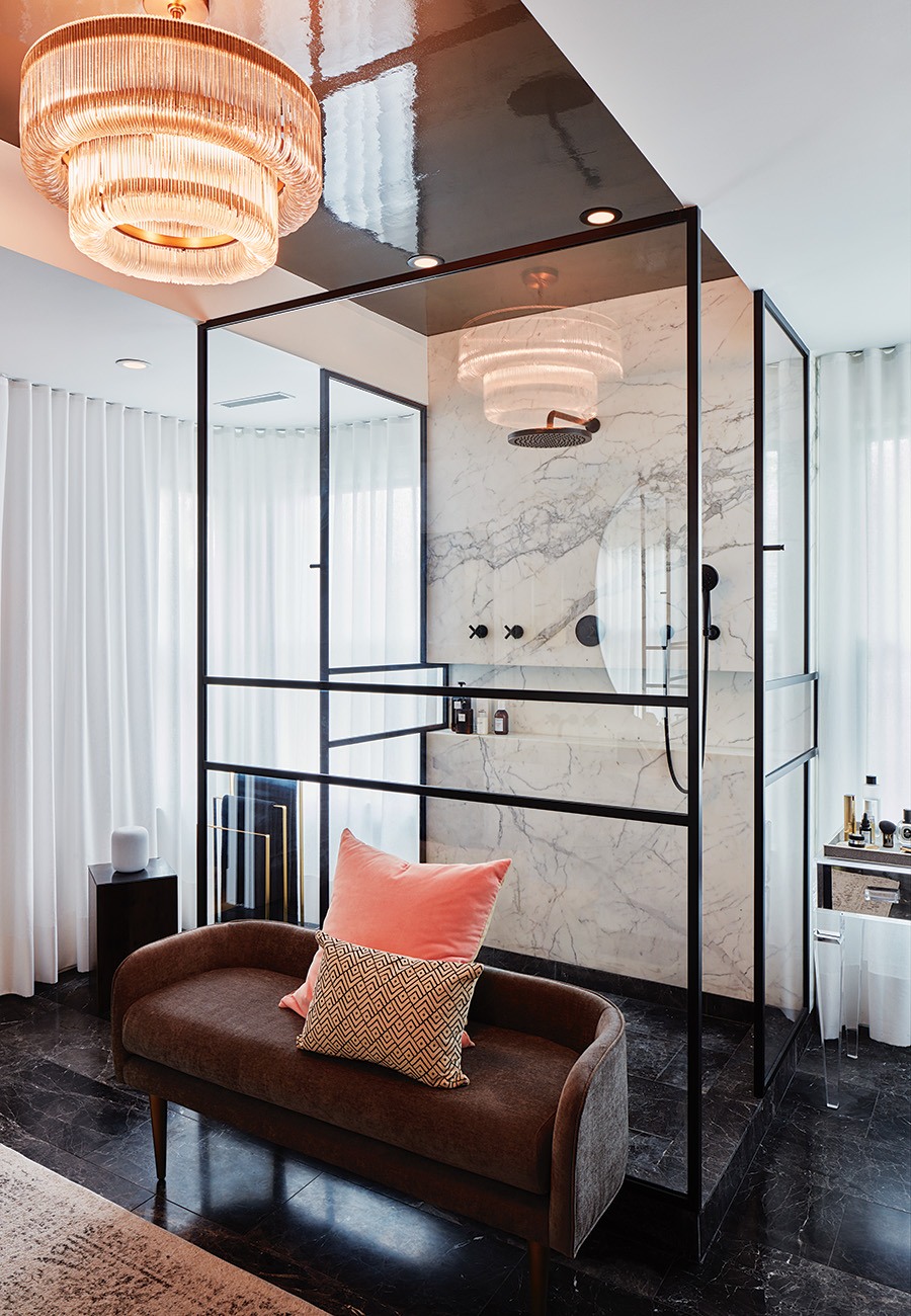
Vast expanses of marble and glass lend a sophisticated air to the master bathroom, where plush seating and an over-the-top chandelier from West Elm feel right at home. / Photo by Jane Messinger
Upstairs, the modern touches continue in the large master suite, which includes a bedroom, a dressing area, and a bathroom. With noticeably less millwork, the color palette shifts and becomes lighter. “Architecturally, the detail on the second floor is less heavy, so the color could be less heavy,” Walker says. “It opened up some great opportunities for Abby’s romantic sense of style.” Case in point: the master bathroom, which channels a chic sitting room with its floor-to-ceiling drapery, vast expanses of marble, and a blown-up, re-cropped reproduction of a painting from the National Portrait Gallery in London. “It gives you the sense that it’s an intimate space in a playful way—a feminine note without overly feminizing [it],” Abby says, “[so it still] looks like John’s bathroom, too.”

The delicate filigree-style millwork and molding in the master suite provided an opportunity for a lighter color palette, complemented by the Cole & Son’s wallcovering on the bedroom ceiling. The pattern has a strong repeat, so the team used a custom-sized mural configuration to make it proportionate to the room, Walker says. / Photo by Jane Messinger
Just outside the bathroom, the master bedroom glorifies natural elements, bringing their ethereal beauty inside from top to bottom. The oversize windows let in plenty of sunshine, while whitewashed walls enhance what Mother Nature provides. “Sometimes you use [bright] colors to celebrate the presence of light, and this was that,” Abby says. Above, the ceiling continues the theme with a mural-sized print of rolling skies—a pattern created by Fornasetti and translated into Cole & Son’s “Nuvole” wallcovering. An Abby-designed installation of suspended butterflies, meanwhile, hovers over the fireplace.

Illuminated by a fixture from Justice Design Group, the third-floor bathroom features a cantilevered vanity. / Photo by Jane Messinger
Continuing up to the third floor, which lacks the woodwork found elsewhere in the house, the architecture and décor get a lot less formal. Here, Abby and John sought a Scandinavian vibe, embracing a quiet, but textured, palette for the floor’s comfy den area and guest spaces. The rooms create tranquil spots to hang out, and finish off the house nicely—like a dollop of whipped cream added to the top of a rich dessert. “We wanted it to feel like a treat when you got up here,” Abby says. And it does.
Architect
Walker Architects
Contractors
Ben Donoghue; Cambridgeport Construction; Gilman Guidelli & Bellow
Landscape Architect
Matthew Cunningham Landscape Design
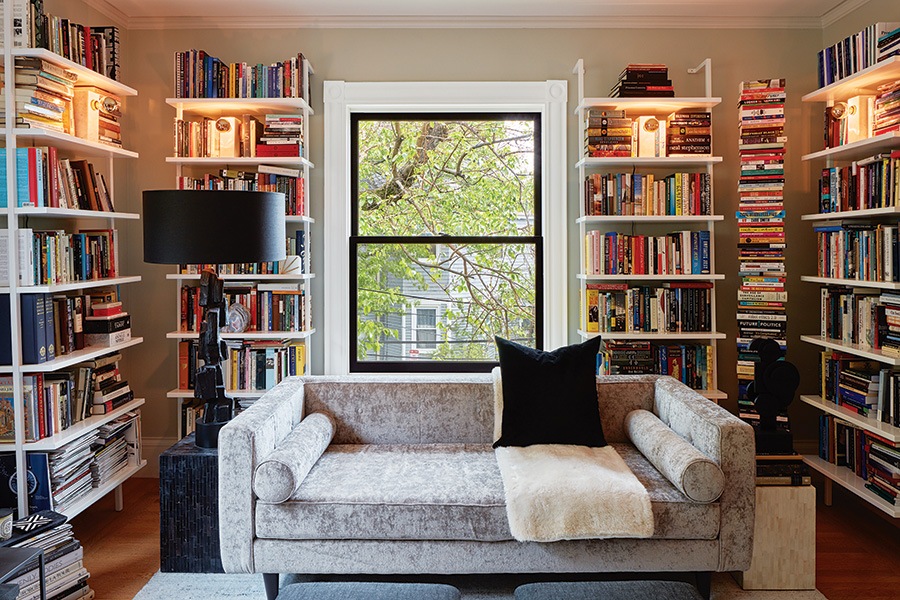
Color-coded shelves? Not in Abby’s home office. “[I spend] a lot of time reading and writing,” she says. “It’s a real work space, [so we had] to design for that.” / Photo by Jane Messinger

On the second floor, the house’s original doors and molding shine with new coats of the dark gray paint used on the first floor. / Photo by Jane Messinger
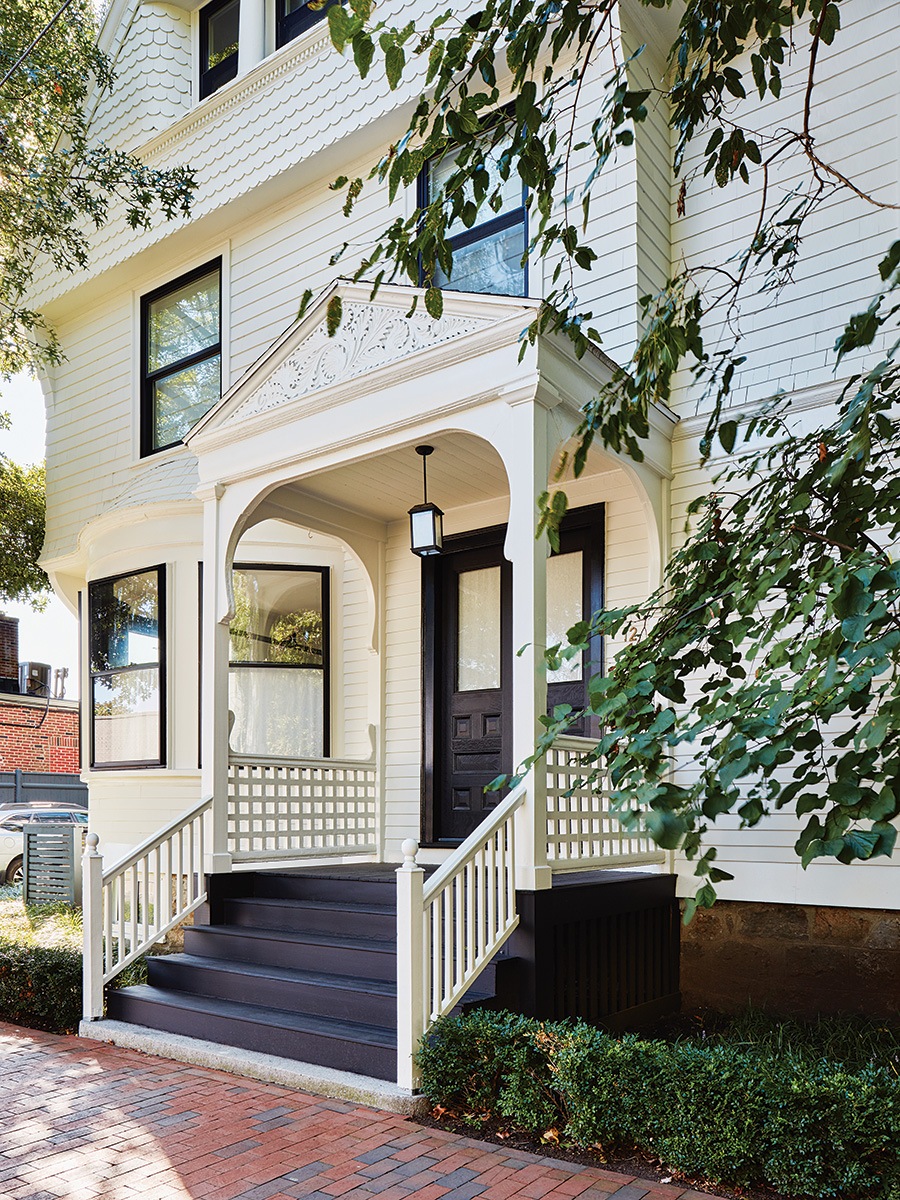
The black-and-white exterior of John and Abby’s Cambridge home hints at the color scheme inside. / Photo by Jane Messinger