Interior Designer Kerri Pilchik Gives a Chestnut Hill Home Colorfully Balanced Character
To reflect the family of four who inhabits it, a new house is fine-tuned with boldness, pattern, and personality.

The homeowner, a therapist, spent much of COVID seeing patients in her third-floor office, where the serene vibe is punctuated by pops of color. / Photo by Jane Beiles
From Boston Home’s Summer 2023 issue.
Interior Designer
Kerri Pilchik Design
Newly constructed, with an expansive layout and a Chestnut Hill location, this home seemed perfect for the family. And yet, something integral was missing: Aside from some lovely millwork, the house lacked character and a connection to its inhabitants. Luckily, the homeowner, who shares the house with her husband and two children, knew just the fix. She tapped her high school friend, interior designer Kerri Pilchik, who eagerly took on the project.
“They [the homeowners] wanted the home to have a ton of personality, color, and warmth and for it to feel like them,” says Pilchik, who created a bold, balanced scheme layered with rich, patterned textiles and wallcoverings and globally inspired accessories.
“The wife is Korean American and loves global influences and jewel tones. The husband is half–Puerto Rican and half–Swedish American,” says Pilchik, noting that touches throughout the house nod to the couple’s heritage, including the Swedish sconces and a vintage Korean vase in the living room. “They love to travel and wanted spaces that were fun and colorful but with two young children, not precious.”
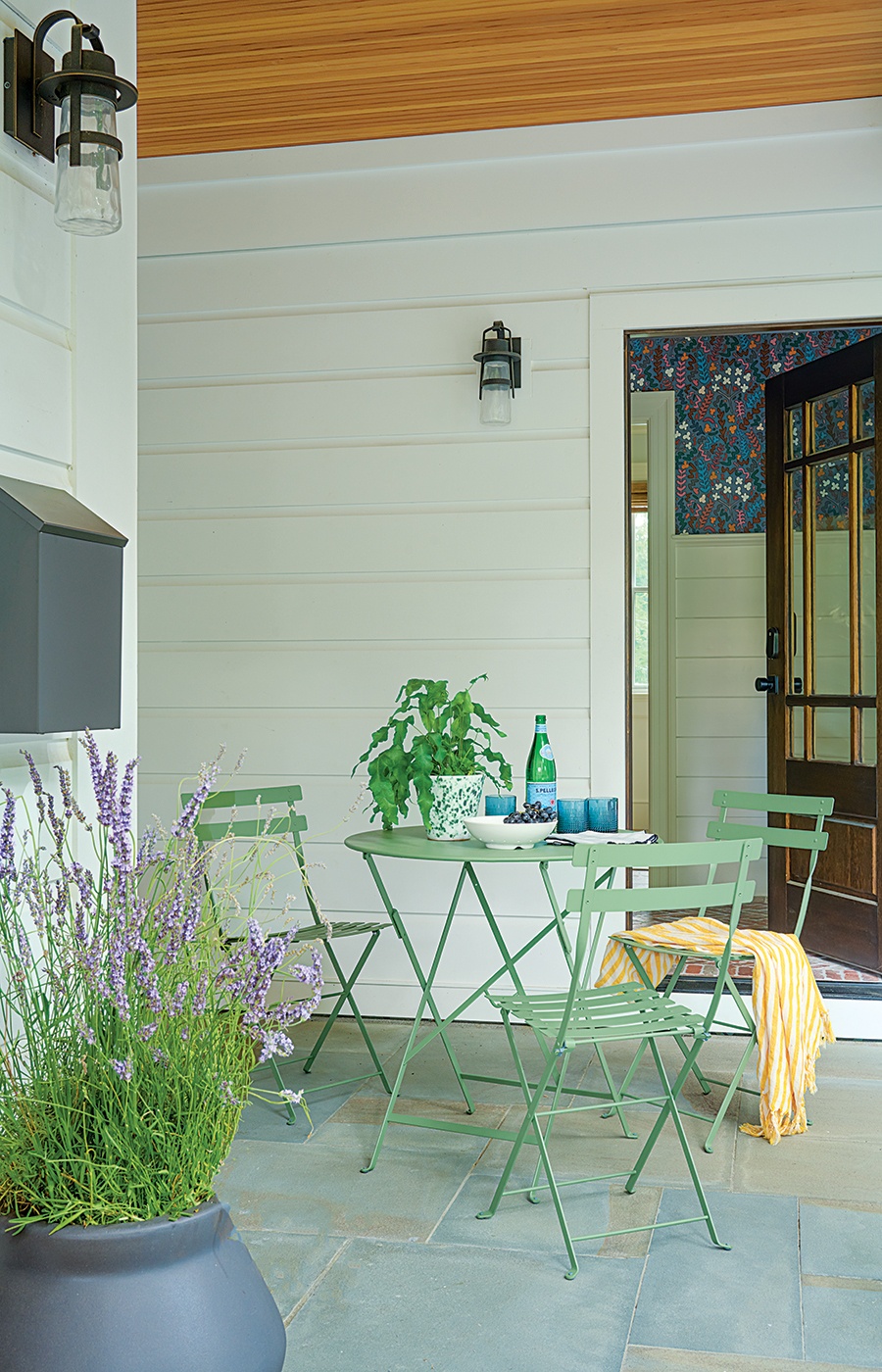
The front porch overlooks the driveway, where the basketball hoop is. “The kids often sit here with their friends when they take a break from playing,” Pilchik says. / Photo by Jane Beiles
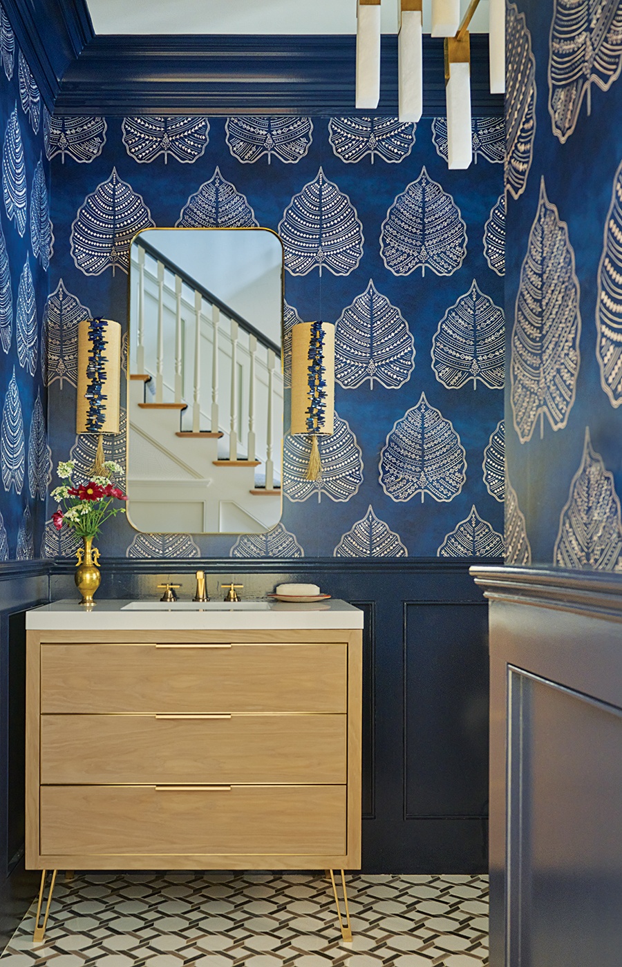
The millwork in the first-floor powder room is painted high-gloss navy blue; the Seema Krish wallcovering has a large-scale motif that works well in the small space. / Photo by Jane Beiles
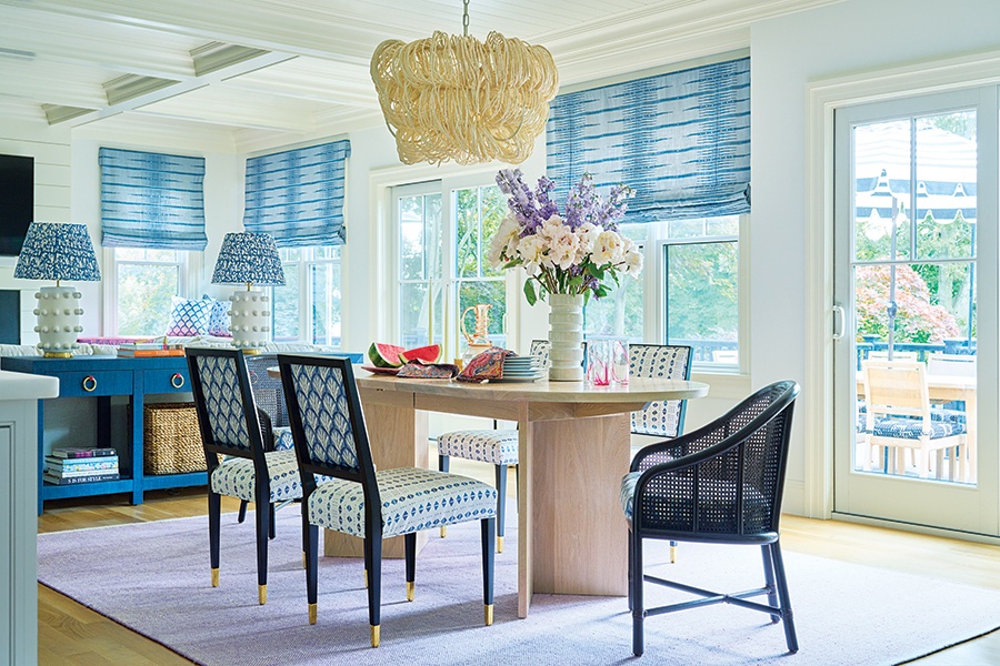
The dining area light fixture, made of cocoa beads, “feels light and airy, yet different,” Pilchik says. The plush lavender rug was custom-made in India. / Photo by Jane Beiles
While Pilchik focused primarily on aesthetics, she did recommend to the homeowners that a wall be installed between the family and living rooms. With an open plan on the main level, she felt that the layout would benefit from some separation between the two key spaces. “I’m more of a traditionalist. I like walls. I like when a house has both formal and casual spaces,” says Pilchik, who designed pocket doors between the two rooms that are flanked by built-in shelves in the living room. Here, a calming, enveloping effect was achieved by painting the millwork a blue tone that matches the grasscloth wallcovering; the velvet sofa is just a shade darker.
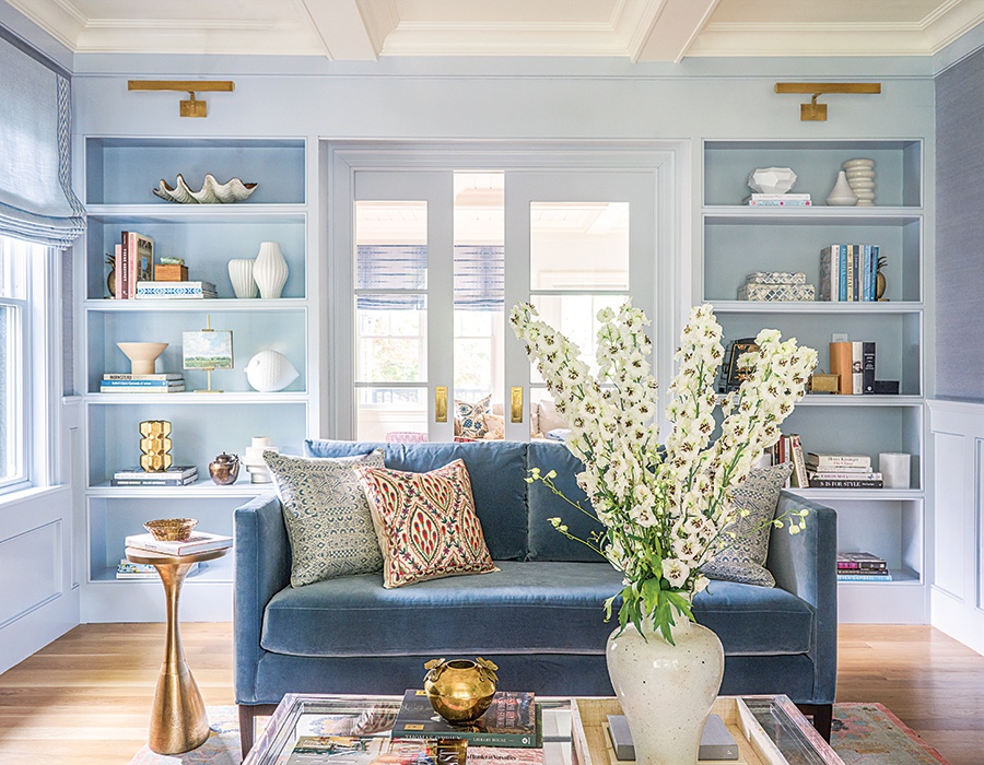
Photo by Jane Beiles
Pilchik kept the millwork white for its bright appeal in the open kitchen, living, and dining area and selected different fabrics and hues for each space to create distinction. “I want the spaces to flow together but not be repeats of each other,” says the designer, who enlivened the white kitchen by painting the base of the island a navy-gray color. Serena & Lily counter stools have cushions made from a pink-and-white Peter Fasano fabric that Pilchik had laminated. “They wipe right off, so you don’t have to worry when kids sit and eat there,” she says. And no need to worry that the cushions will feel like institutional seating—“they have a real matte feel, not plasticky at all.” An adjacent space in front of the windows overlooking the backyard went from awkward to attractive by creating a sitting area with two chairs upholstered in Zak+Fox’s “Tulu” fabric.
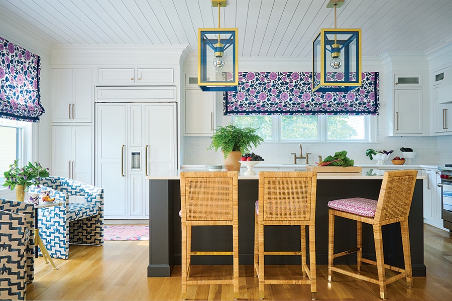
The kitchen’s Urban Electric pendant lights are a custom shade of blue that doesn’t quite match the base of the island. “I wanted the color to be a little different,” Pilchik says. / Photo by Jane Beiles
When the homeowners protested that the charcoal grasscloth Pilchik selected for the walls of their bedroom was too dark, the designer held firm, and the couple quickly came to love it. “The room doesn’t feel like a cave, because I kept everything else light,” she says, pointing out the ivory velvet drapes, gold finishes, and a linear midcentury light. The space is also rife with global influences, including the Moroccan-inspired rug and Suzani bedding.

The velvet drapes in the primary bedroom have a band of aqua trim based on a bench the homeowner already had; the hue is also reflected in the bed sheets. / Photo by Jane Beiles
One of the wife’s favorite colors is fuchsia, and the feminine hue is subtly woven throughout the home. In her personal office, the desk chair is upholstered in an overscale fuchsia-and-orange ikat pattern; a purple velvet chaise exudes modern elegance, while the walls and ceiling are sheathed in Cole & Son’s interpretation of Fornasetti’s “Nuvole,” which depicts an etching of fluffy clouds. Both dreamy and dramatic, the room, like the house in its entirety, is a beautifully personalized haven.
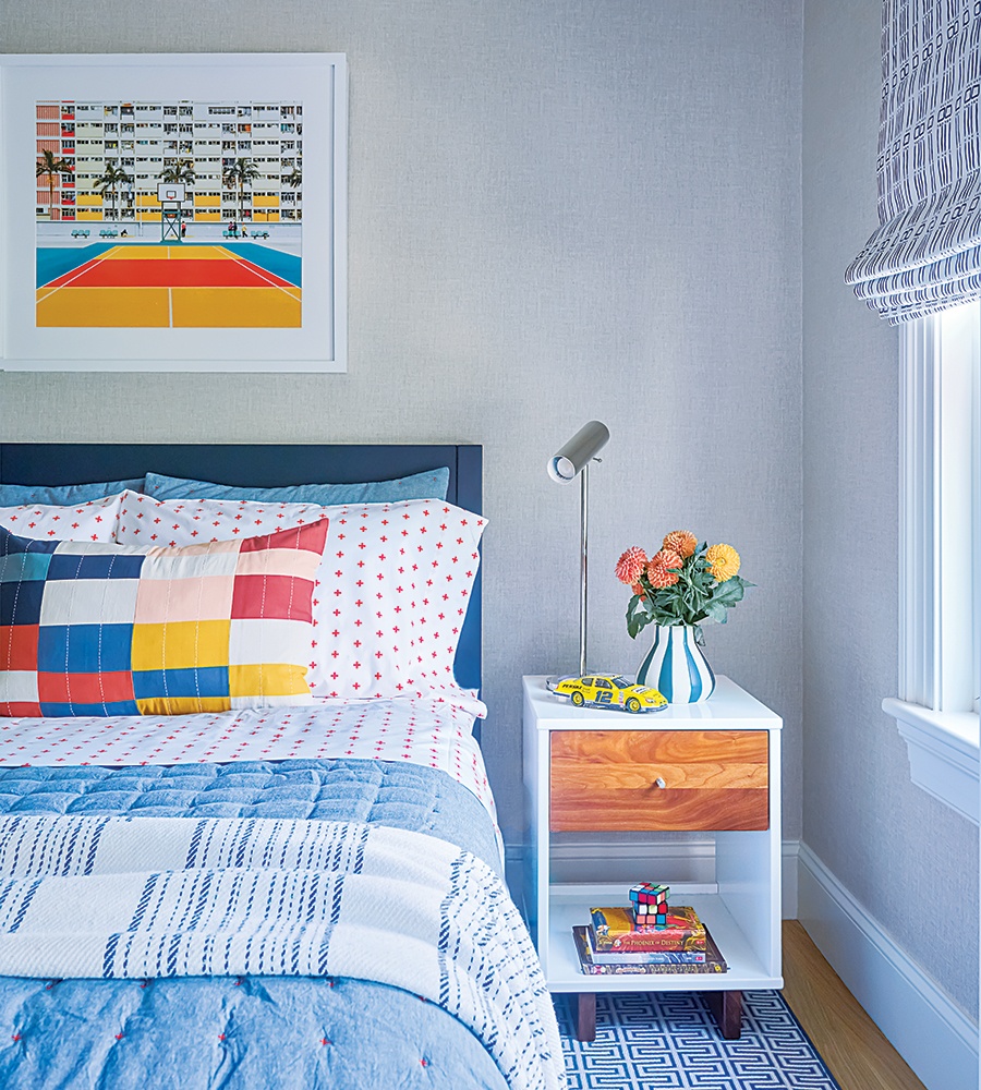
The son loves basketball, and while Celtics posters weren’t an option for the walls, Pilchik found a colorful print featuring a tropical basketball court. / Photo by Jane Beiles
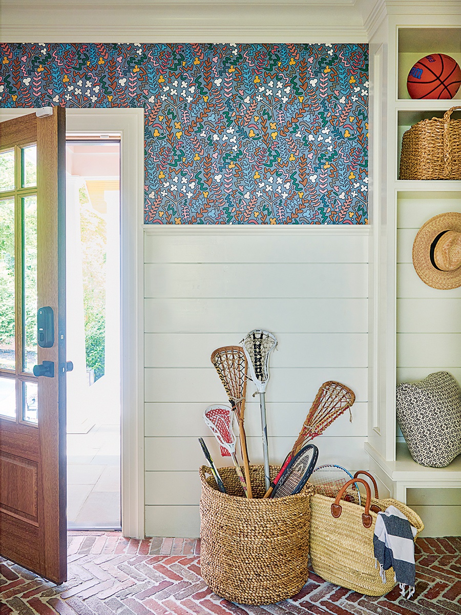
Photo by Jane Beiles
Uniquely Utilitarian
Mudrooms tend to be family pass-throughs, catchalls for the necessities of daily life—shoes and coats, sports equipment, the obscure umbrella—and while guests don’t often enter through these areas in favor of a home’s more formal entry, Pilchik makes a strong case for creating one that’s beautifully designed. Here, the brick floor is both highly durable and, laid in a chevron pattern, visually appealing. Shiplap clads more than half the length of the wall, and Pilchik opted to jazz up the upper portion with a whimsical Ottoline wallcovering featuring a colorway that picks up tones from the brick.
First published in the print edition of Boston Home’s Summer 2023 issue, with the headline, “Character Reference.”