Behind the Design: Albertine Press for Backbar
Welcome to Behind the Design, a series where local blogger Charlotte Wilder explores the thought behind the design of restaurants. Because, after all, the visuals are just as important as the food in the dining experience. The final Backbar business card. Scroll to see how they’re made at Albertine Press.
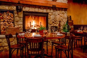
A press shop and a restaurant might not seem like obvious playmates, but Union Square-based Journeyman and its new offshoot, Backbar, are quite friendly with Albertine Press. Shelley Barandes, founder and owner of Albertine in Somerville, worked with the Journeyman and Backbar owners to design and print their menus, business cards, and gift certificates that define the rough-hewn, clean aesthetic of both establishments.
The collaboration began as many lasting relationships do — through friends of friends. The owners heard about Albertine through a mutual connection, and ended up discussing branding ideas prior to Journeyman’s inception. By the time Journeyman was to become a reality, Barandes told me, “[Owners Diana Kudajarova, Tse Wei Lim, and Meg Grady-Troia] came to me and said we’re ready to do this, let’s work together on some identity.” To start the process, Barandes asked the owners to come up with several words to describe their concept; they landed on industrial, elegant, textural, comfortable, and sparse. Grady-Troia explained, “everything, down to the choice of the paper we print the menus on, was informed by those words.”
Grady-Troia also said “the goal was always, with both Journeyman and Backbar, to find some element that exists in the very essence of the restaurant or bar and have that theme inform the way we structure every [design element].” Barandes did just that, incorporating the large wooden shutters hanging in the dining room of Journeyman into their business cards, and using lower case italics to harness the laid-back feel of Backbar in the design of its menu. Friendships don’t often have many material objects to show for themselves, but in the case of Albertine, Journeyman, and Backbar, the proof is in the paper.
Here, a series of photos I took of Barandes printing the business cards.
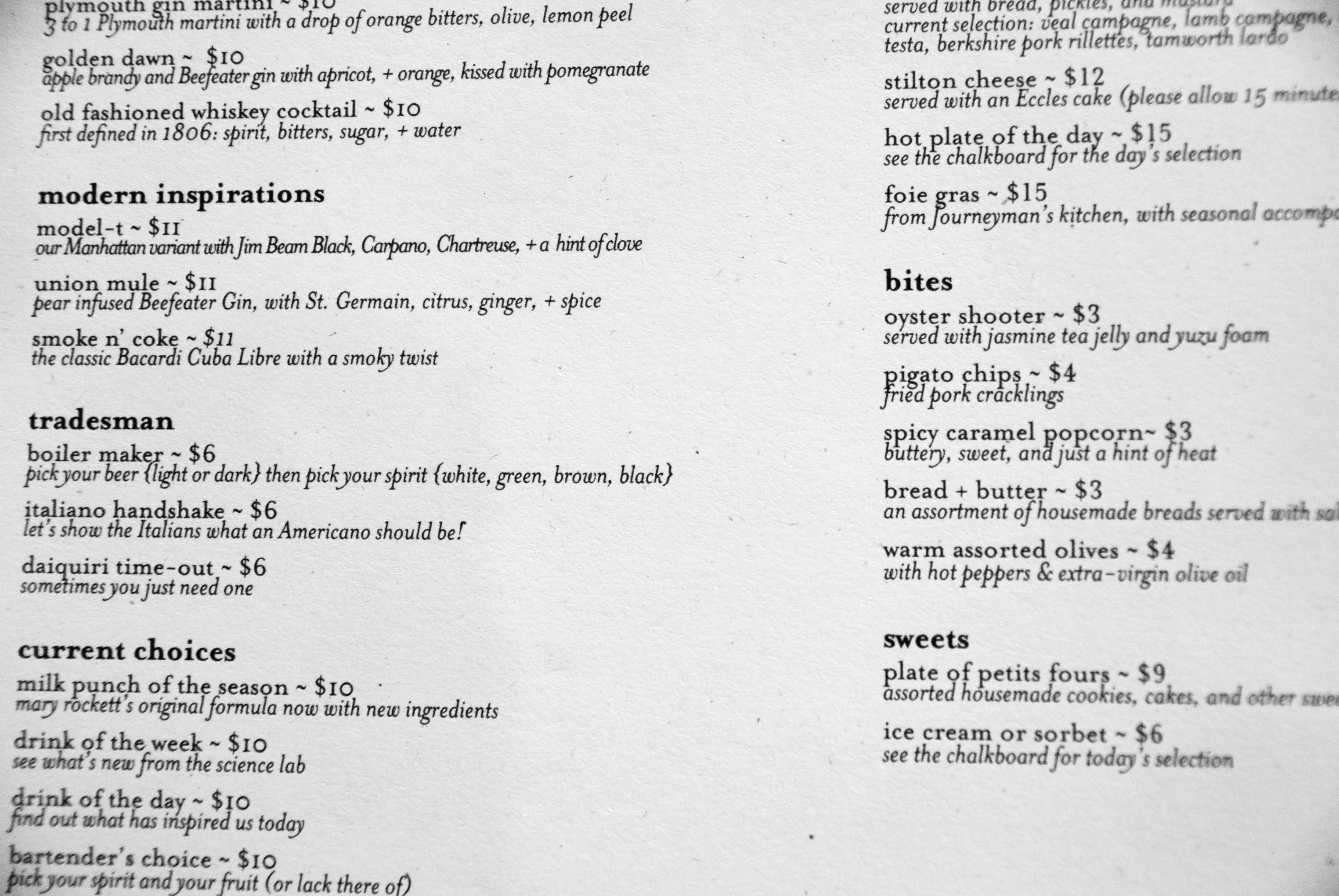
The Backbar Menu. Barandes said, “we went with upper and lowercase, and italics. It’s such a simple menu that you want to know, “this is it, this is what they’ve got.”
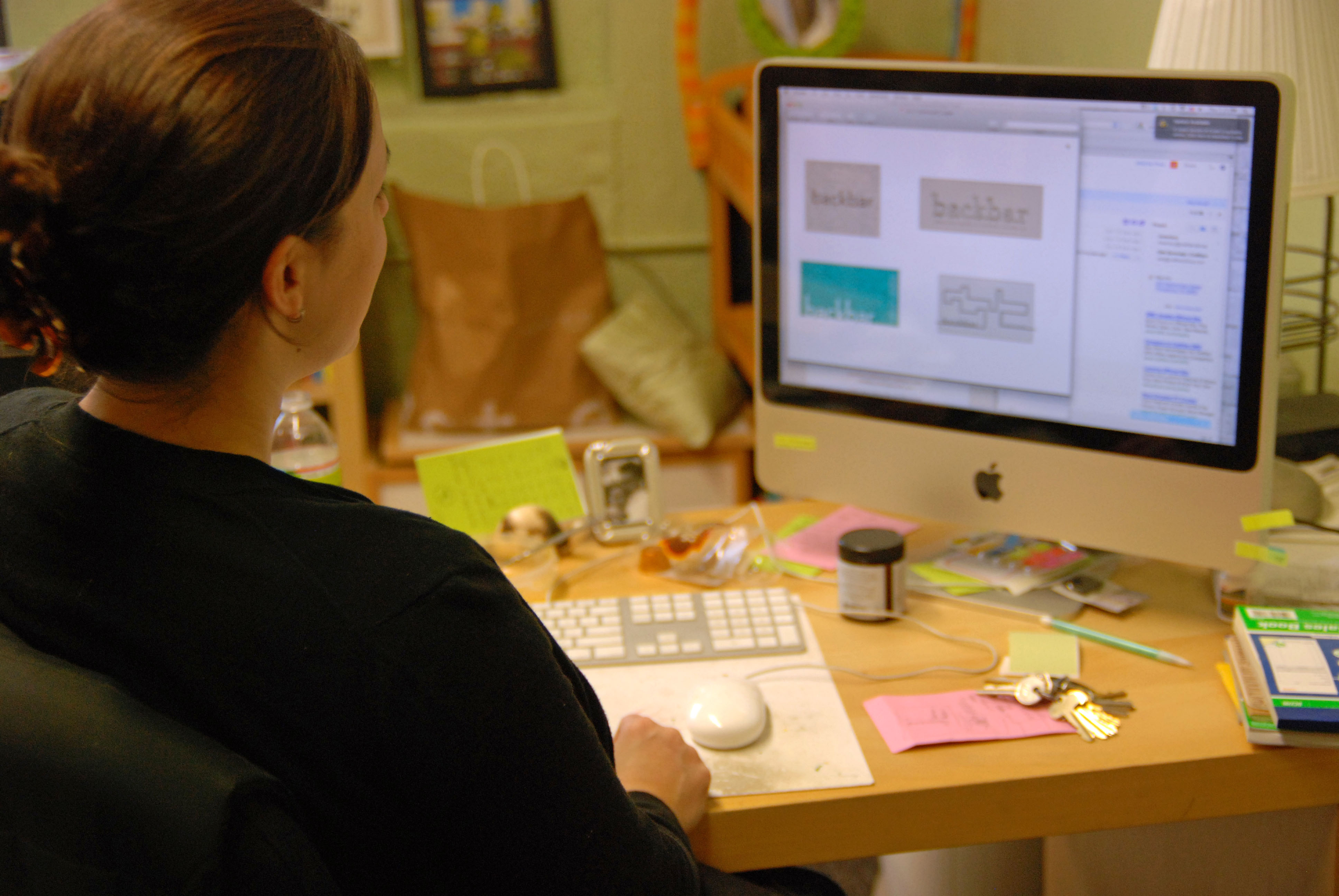
Barandes pulls up some earlier designs for Backbar’s business cards. “We tried to incorporate the shelving of the bar itself in the early renditions,” she said. “We used [the shelves’] outline as a graphic, but it just didn’t work — I mean, you try a lot of things, and often times they just didn’t work.”

Barandes prints a sheet of Backbar’s business cards on a press in her shop.
A sheet of printed cards dry before they make the second run through the press for their rosemary design. In order to get two colors onto a piece of paper, Barandes has to run the same piece through the press twice, so elements that must be printed in different colors have separate plates.
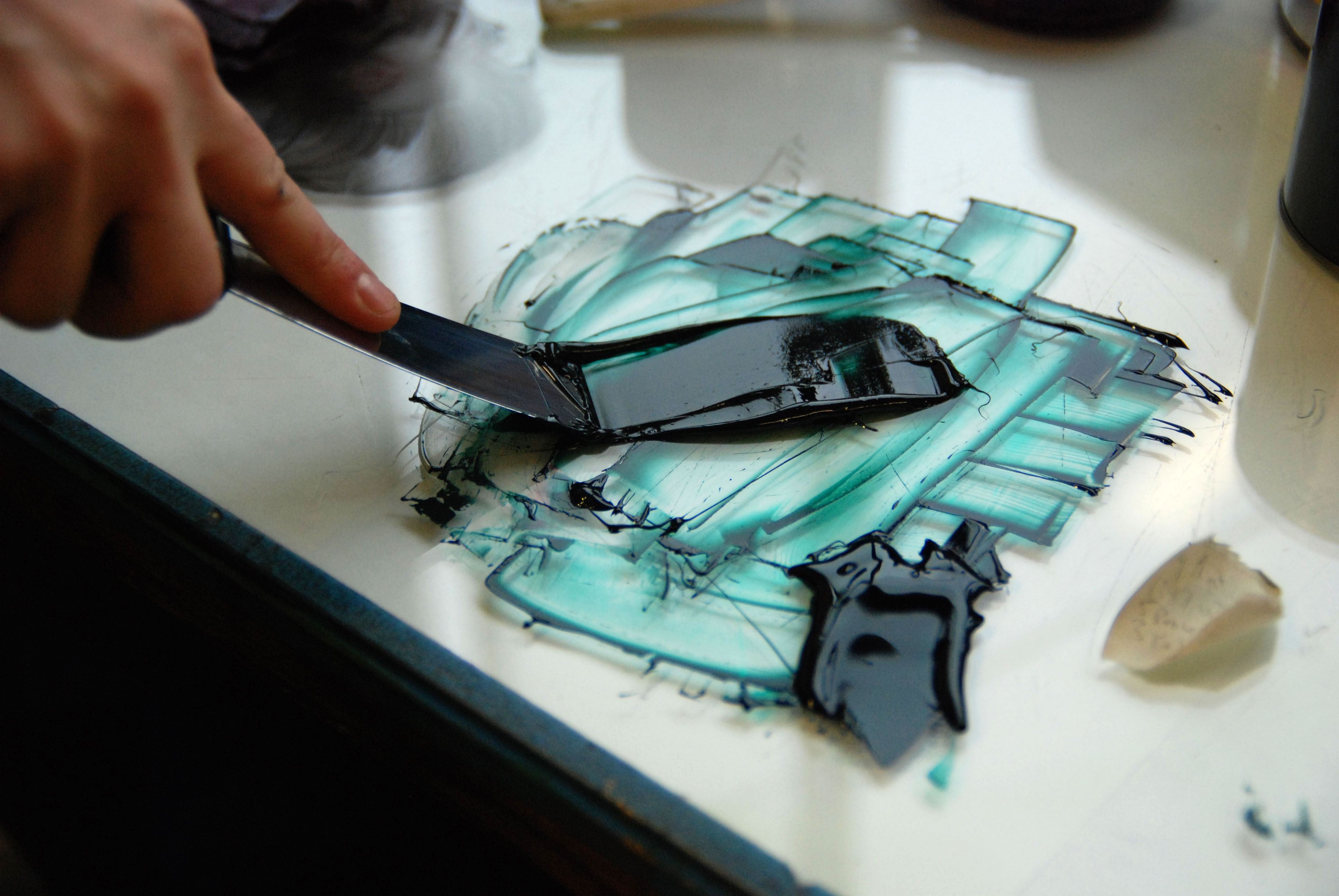
Barandes mixes ink to put on the press for the green of the rosemary design.
Barandes’ grandfather had a print shop, so ink is in her blood. Here, she prepares to print the rosemary onto the cards.
The second run through the press to print the rosemary.
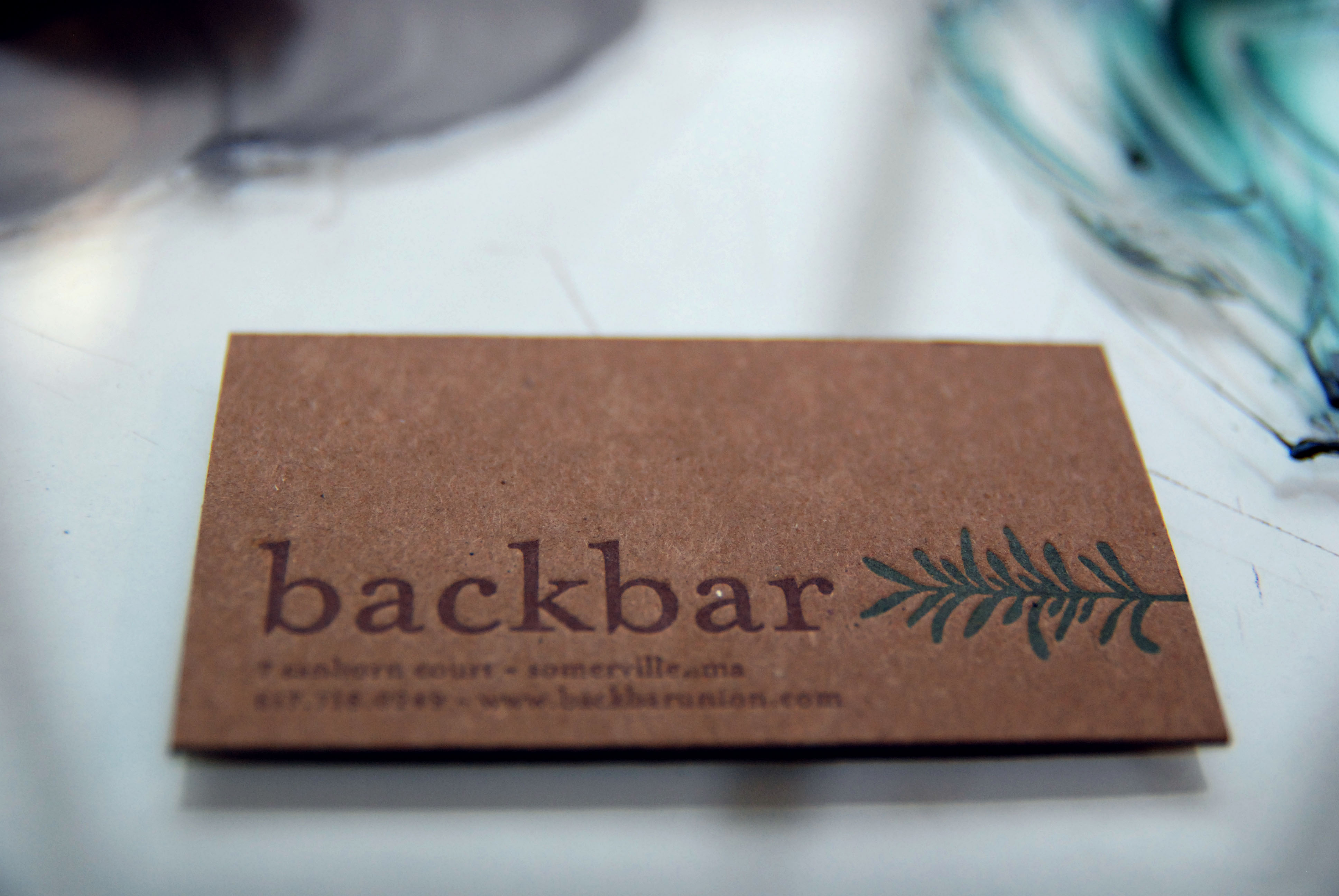
The finished product, a freshly printed Backbar business card! “The design ended up being more similar to Journeyman because it works for the space, and the business, and the relationship between the two places,” she said.