Behind the Design: Area Four's Iron-Hot Logo, Menus Against 'The Man'
Welcome to Behind the Design, a series where local blogger Charlotte Wilder explores the thought behind the design of restaurants. Because, after all, the visuals are just as important as the food in the dining experience.
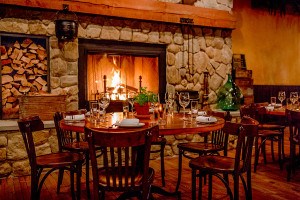
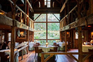
![]() All photos by Charlotte Wilder
All photos by Charlotte Wilder
Great restaurant graphics are meant to catch the eye and set the stage for the coming experience. By those standards, it’s clear after one look at the logo and menu of Area Four — created by Fort Point-based designer Jessica Sutton — that you’ve arrived in a sleek restaurant with a sense of humor. I recently talked to Sutton, owner Michael Krupp, and chef/owner Michael Leviton about the restaurant’s design concept; read on to learn about the logo’s origins, the owners’ obsession with The Clash, and Leviton’s slightly wicked streak.
In order to honor the space’s industrial feel, owner Michael Krupp and Leviton wanted a logo that was both urban and simple. “The name Area Four comes from the section of Cambridge where the restaurant is; that’s what it’s been sectioned off as in city zoning,” Sutton says. “So I started thinking about what the city planning would look like on a map, and thought of crates and the stamps on the side, like Area 51.” Her first design go-round featured logos that resembled spray-painted stencils (view the progression below):
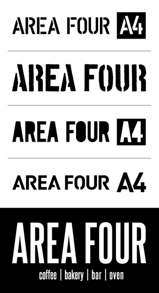
The lines in between the stenciled letters felt too contrived, so Sutton, Krupp, and Leviton went from the idea of a stencil to one of branded wood. “Eventually we came to a strong type face that feels urban but also has a bit of a more modern twist,” Sutton says.

The team then decided to take the idea of wood branding and run with it. “We had a branding iron of the logo made to mark the wood that fires the pizza oven,” Sutton says. “We got to play with it [in my office]. It was terrifying.”

Even though the pieces will be burned, the logo gives an added element of surprise to the wood piles (which Krupp chops up himself) stacked by the oven.

Sutton says that the goal for the menu’s design was to keep the template simple, since Leviton and his team change the offerings daily. The menu uses the same font as the logo, and shows off Krupp and Leviton’s silly side — the front page has a quote on the upper right corner whose header reads: “Daily Quote from The Clash’s Joe Strummer for Your (and Our) Amusement.”
“We’re huge fans of The Clash, and we wanted something that was fun,” Krupp says. “We wanted to offer a little gem to our guests. [The band] is a subject near and dear to my formerly punk rock heart.”

The Clash defines his restaurant philosophy, according to Leviton at least. “They certainly were punk, but they also wanted to appeal to a larger audience,” he says. “I sort of feel the same way, in that I still want to say ‘fuck you’ to ‘The Man,’ but in some ways, I have become ‘The Man’.”
Leviton’s subversive outlook doesn’t stop at the quotes at the menu. Three closets in the main dining room are labeled: “Dry Goods (not the bathroom …),” “Office (…a lso not the bathroom),” and finally, “Emergency Exit (… definitely not the bathroom).” Clean, modern lettering delivers the information — both on the walls and on the menus — in a lovely and quietly ironic way that speaks to Leviton and Krupp’s vision of a high-quality restaurant with a punk-rock attitude.


With help from Sutton, Krupp and Leviton’s vision for their restaurant concept came alive. They’ve found the sweet spot where aesthetic meets intention, and the result is a fun and devilishly delicious dining experience.
(Area Four, 500 Technology Square, Cambridge, 617-758-4444, areafour.com)
For more online food coverage, find us on Twitter at @ChowderBoston
Ed. note: an earlier version of this post named the designer as Jennifer Sutton. The designer’s name is Jessica Sutton.