The Story Behind Trillium Brewing’s Labels
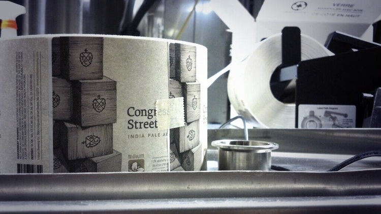
Photo by Kevin Cimo
Most homebrewers don’t exert the additional effort to incessantly detail their successes and failures via a professional designed blog. Nor do they craft several different beer styles for hundreds of people, particularly if that event happens to be their own wedding. And they certainly don’t hire a respected graphic designer—to channel the crosshatching and detail synonymous with Cook’s Illustrated—for beer labels years away from being applicable. But then again, most people aren’t JC Tetreault.
Truthfully, Tetreault was never some anonymous dilettante dabbling in a detached weekend hobby. Even before he opened Trillium Brewing Company in Boston’s Fort Point neighborhood, Tetreault was a serious brewer. That’s why— in his own mind, at least—he could justify his creative partnership with designer, Kevin Cimo.
The two met each other through mutual friends 14 years ago, while Cimo was in the early stages of his career, toiling away at a five-person advertising agency in Providence. This was before Tetreault’s wedding, where Pot & Kettle Oatmeal Porter made its first public appearance, each hand-labeled bottle a reflection of Cimo’s brand new passion project.
Now, Cimo is an associate creative director at one of the biggest ad firms in the nation, Hill Holliday, where he spends most of his time, not behind a drafting table, but conceptualizing TV commercials for blue-chip clients like Cadillac. But in Cimo’s off-hours he still works at Trillium, where he collaborates with Tetreault on each aspect of the breweries logo, website, and label design.
“I still think of myself as an underdog working at a smaller shop,” Cimo says. “Cadillac is the complete opposite of what I’m doing with JC, but they’re both incredibly fulfilling. Working with a small company is so personal and gratifying.”
What began as a rough, feeling-out process, has now turned into a fine-tuned methodology. That means, “no funny names, no cartoons, and no unnecessary puns,” Tetreault says.
“We want to make sure our beer and our brand feels like it has been around for a while, but still has a current interpretation,” Tetreault says. “We wanted to make sure we weren’t being too gimmicky with things either, just more of a refined approach, you could say. Also, we want everything to be hand-drawn to match the handcrafted nature of our beers. That element is consistent throughout our products.”
Here in their own words, are the inspirational landmarks, song lyrics, and hidden Easter eggs, which make each Trillium label an intricate work of art.
1. Farmhouse Ale
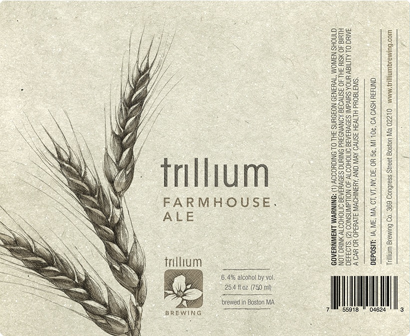
“This being our signature beer, we struggled with this for a long time, but it’s the one people comment on the most,” Tetreault says. “It’s considered the most elegant label that we have. That’s why we struggled so much with it. The image we’ve got here mimics what we try to do with the beer. It’s super simple and kind of rustic, but it’s got this tremendous elegance and beauty to it. I think that inherently resonates with people, wherever you’re from and whatever your experiences.”
2. Fort Point Pale Ale
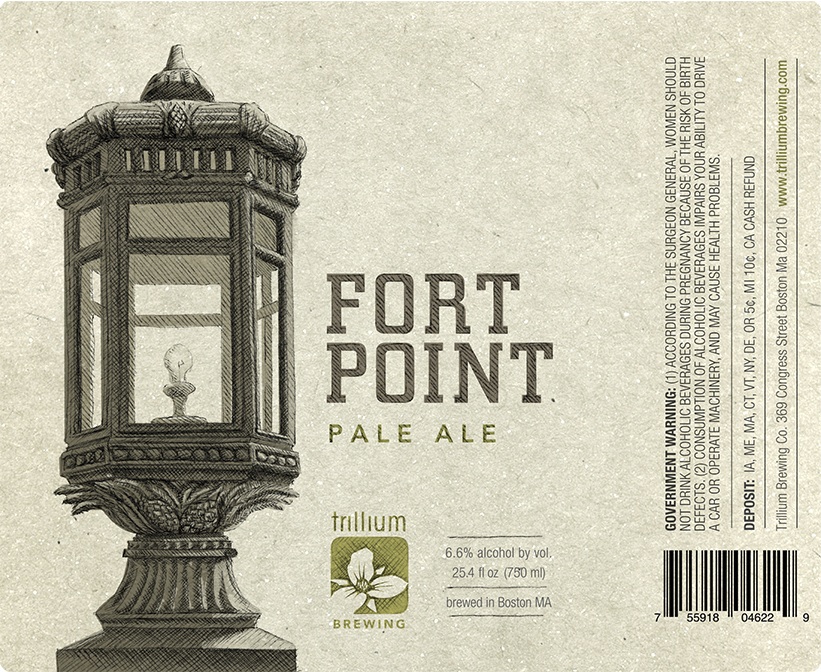
“We’re such a small neighborhood brewery, which is how it used to be, and probably should be to this day,” Tetreault says. “Every neighborhood or community should have a beer they’re most proud of. That’s what we envision our Fort Point Pale Ale to be, being in Fort Point Channel. There are these iconic lamps on the Congress Street leading to the Congress Street Bridge. The people who live and work in the area would instantly recognize them. Kevin and I worked on it to make it more interesting with some subtle decorative embellishments. We have some barley at the base of the lantern and some hops as well. It’s always nice to throw something in, where even after a year of staring at it, you’re still finding something new.”
3. Pot & Kettle Oatmeal Porter
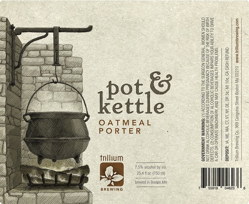
Trillium Pot & Kettle oatmeal porter.
“This was one of the first three labels we ever put together; something we did for JC’s wedding,” Cimo says. “Back then it was a much simpler screen print-style illustration. Now, with our new layout it gets much trickier though because it’s a really odd space to try and fill with an illustration. You have one-and-a-half inches to tell a whole story. This is an old New England fieldstone fireplace that was probably in every home around Boston and helped people cook and brew their own beer. And an oatmeal porter is something that would have been made around here in Colonial times. It’s British inspired, but very New England in nature.”
4. Congress Street India Pale Ale
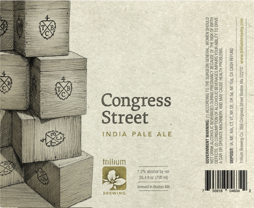
“Similar to our Fort Point Pale Ale, we wanted to draw something that people were super proud of,” Tetreault says. “People around here are that way about the Red Sox, their local beer, and of course, the Boston Tea Party Museum, which is right around the corner from the brewery. The Tea Party Museum is actually on Congress Street, so the boxes are reminiscent of the East India Trading Company tea boxes that were thrown overboard. We just updated the logo and branded a Trillium Brewing Co. logo on the side with the outline of a hop cone around it.”
5. Heavy Mettle Double IPA
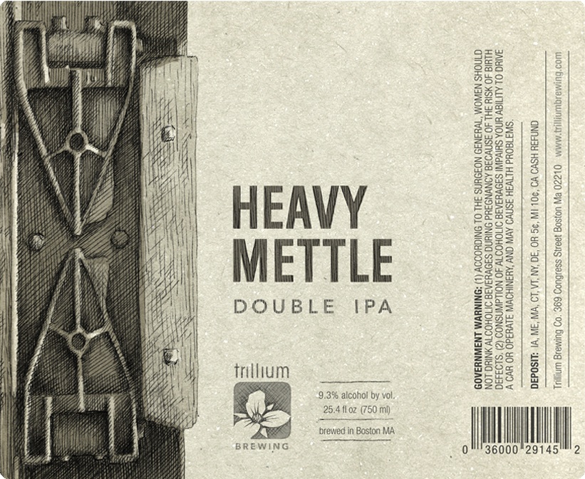
“When we first started building the brewery, we knew the [current] retail space was the only space at grade for our retail entrance,” Tetreault says. “There was a plywood floor contiguous with the rest of the space. I just thought there were some beams underneath supporting it, so we popped up the plywood and underneath was three feet of construction debris, broken brick, concrete, and dirt. It was a goddamn terrible moment in my life. We had to haul out three dump trucks full of this disaster. That took some serious perseverance, but there was some cool elements of this old industrial building that was a huge find, including these medal loading dock parts that date back to 1918.”
“The meaning behind the word ‘mettle’ is perseverance or striving through a lot of challenges and eventually coming out on top,” Cimo says. “So how do you translate that into a visual? Everything we do visually can be tied back to an area, a personal experience, or something the brewery can relate to. Some are very literal, while others are little bit more abstract or representative.”
6. Wake Robin Farmhouse Red Rye Ale
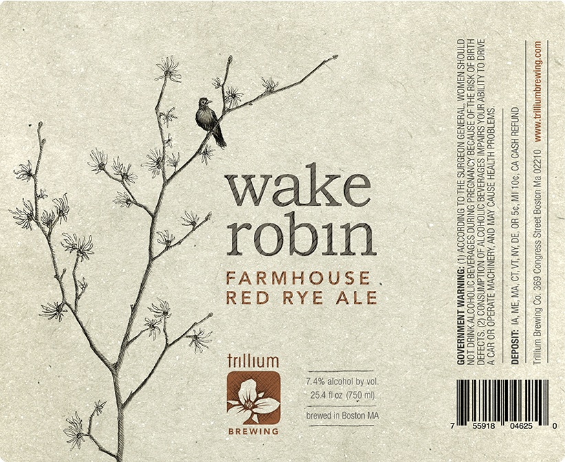
“Trillium is a native North American woodland wildflower that symbolizes American durability and balance. It symbolizes what we’re trying to achieve in our beers,” Tetreault says. “Trillium is the Latin name for the flower and Wake Robin is its common name. When it blooms in spring or early summer, its said to wake up the robins, hence why we put a robin on the branch.”
“What’s interesting about the flower is that there are three of everything on it,” Cimo says. “There are six stamen, three giant petals, three small petals below that, and then every three inches there are leaves that stick out. It’s really interesting to look at. I wanted to make the label very symmetrical and geometric. One of the early designs was almost Celtic in nature, but JC steered me in a more organic direction.”
7. Sunshower Super Saison
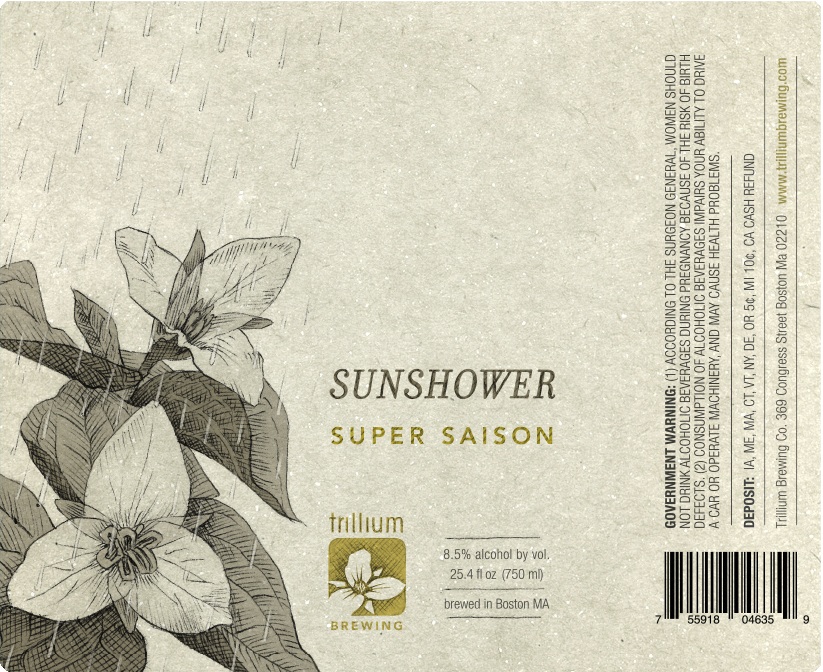
Trillium Sunshower
“A lot of breweries take names from songs or bands they really like,” Tetreault says. “Chris Cornell has a song called “Sunshower” that I was inspired by. There’s this moment when it’s still raining, but the sun is still shining through, and not to sound morose, but it’s pretty tough to operate a brewery sometimes. But it can also be really freaking fantastic. This label is supposed to reflect that juxtaposition.”
369 Congress St., Boston; 617-453-8745 or trilliumbrewing.com.