Louie Berceli on Modernism, Mystic Brewery’s Beer Labels, and the Endless Knot
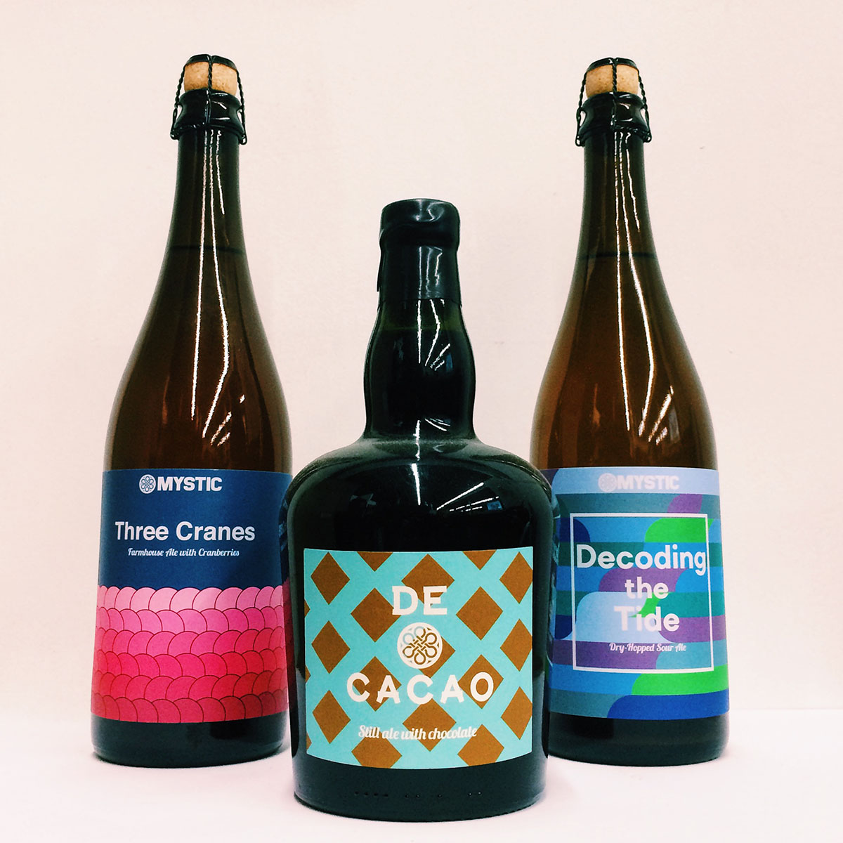
Bottles from Mystic Brewing. / Photo provided
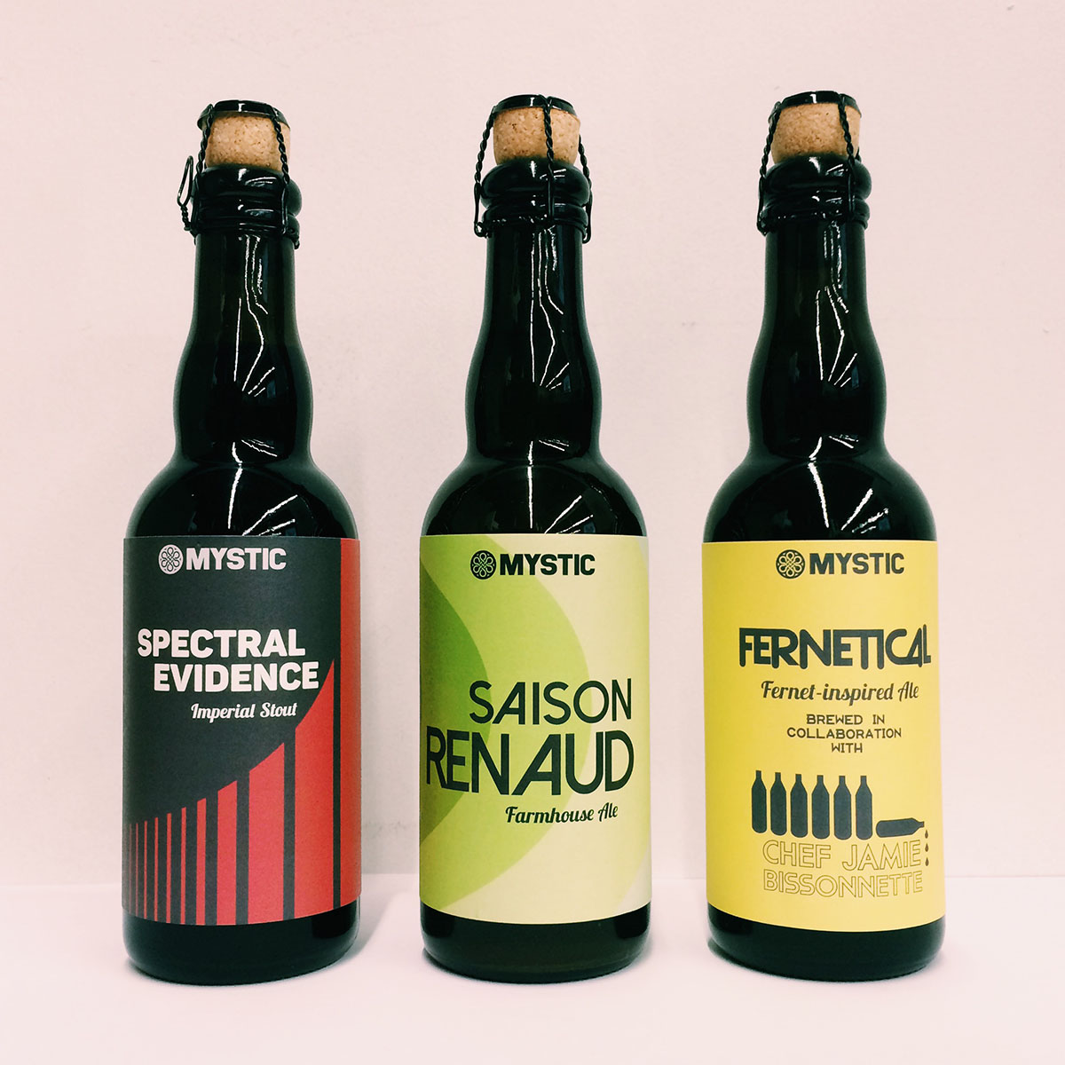
As liquor store shelves brim with more beer choices than ever before, original artwork and branding have become a key way breweries make an impression. To keep things eye-catching, companies like Oxbow Beer, Stillwater Artisanal Ales, and Mystic Brewery are turning to dedicated, in-house designers to make sure their look is evolving at the same pace as their beer.
Leading the artistic direction for Mystic in Chelsea is creative director Louie Berceli. He started out doing sales at Mystic, but was put in charge of the brewery’s visuals last year. Since then, he has created more than 30 unique designs for the brewery, including brand new labels, revamped original artwork, and taproom merchandise. With his continued focus on Mystic’s presentation, the brewery’s products have found new life on store shelves.
What’s your art background like?
No formal education. I’ve always had an interest in graphic design, but never really thought I would have a chance to do it professionally. It always seemed that if you didn’t study that in art school, you just couldn’t do it for a living—I’m really lucky to have this job in that regard. I’ve done some illustration on the side before, but nothing of this style or scale.
Where do you draw the inspiration for your labels from?
It’s very pared back, a lot of simple geometric designs; just doing as much as I can with as little as I can. It’s definitely minimalist aesthetic, but as far as the actual style, it has a heavy debt to graphic design in the late ’60s and early ’70s.
Bottles from Mystic Brewing. / Photo provided
How has your work at Mystic changed since starting the position?
I’ve become more confident with it. I’ve been paring things back and using more of the label space. Originally, I was redesigning the core beers. I was working to update them, make them look modern, have them stand out on shelves, but also pay respect to the original designs. Now, we’re coming into a more easily recognizable visual language. It’s very clean, sans serif fonts, and we have a color palette that we’re using across everything.
Did you have any part in designing Mystic’s logo?
I did not, that was a designer who was here before me. [Dave Blank] created the original logo and what was the original visual identity, which was very medieval-inspired. It was based on a lot of Trappist breweries. I’m still a huge fan of the logo, I’m glad we’re still using it. Believe it or not, it’s not an Irish knot—it’s a Tibetan symbol called a “mystic knot” [also referred to as an endless knot]. It works really well for the area that we’re in. Boston is a historically Irish city, so it immediately brings that to mind.
What feedback has the brewery received from your work?
It’s been positive, as far as I can tell. I’ve heard that we’re a little more noticeable on shelves, which is exactly what I was going for. Some of the people that were used to the brand from the beginning [needed] an adjustment period. They had gotten used to the old design so much, and [this is] a pretty radical departure from that.
What’s your favorite label that you’ve done?
There’s a couple—one of them we just released, and the other will be released in mid-December. The first one is a beer called Decoding the Tide [pictured, top right]. It was one of the more ambitious labels I’ve done so far. Its design covers the entire label, it’s based on ’70s graphic design. The other beer is called Iron Ziggurat. That one plays around with the space of the label a lot. It’s a very geometric design for me, it incorporates a lot of techniques from the late ’50s, so there’s a lot of very carefully measured grid work on there. A lot of subtle proportions that people probably won’t even notice, but it adds up to a design that I feel really good about.

Iron Ziggurat, by Mystic Brewing. / Rendering provided
What has your art done for Mystic’s branding?
It’s just communicating to people a lot more of the modern, experimental approach that we’ve used [to brew] since the beginning. One of the downsides to the older designs was that we looked older than we were. “Medieval” was an adjective that we heard a lot. We’re building off of that traditional base, but we’re using it as a springboard. We have our in-house yeast lab, we’re isolating new strains from the wild and seeing what we can do with those, we’re experimenting with foraged ingredients, so I wanted a design that would communicate that sort of approach to beer that we’ve been working with.
Mystic Brewery, 174 Williams St., Chelsea, 617-466-2079, mystic-brewery.com.