Digs Design Company Brings Color to a Wellesley Cape Cod Home
The colors of spring (and fall) inform the scheme in the pattern-filled interiors of this 1920s home.

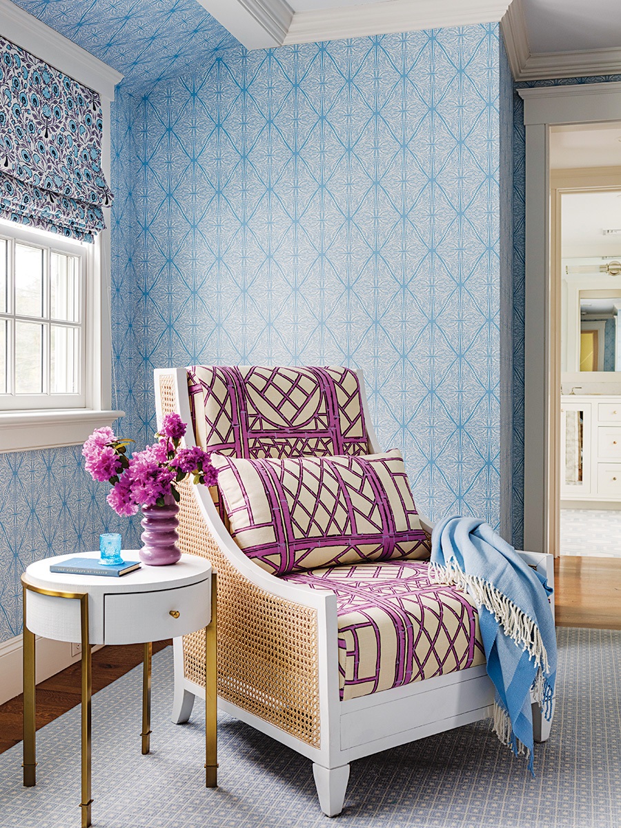
In the primary bedroom, Chiappone played with scale in layering the trellis pattern of the chair cushions against the grid pattern of the wallcovering. “Using pieces like this chair with a wood frame and caning rather than a fully upholstered chair offers the opportunity to use a bold pattern in a more limited way,” the designer says. / Photo by Greg Premru
“I don’t think about it much, but there’s color in my clothes and everything around me,” Jocelyn Chiappone’s client says thoughtfully. That Chiappone’s firm, Digs Design Company—known for fearlessly fashioning multihued patterned pieces into chic schemes—designed the interiors of the 1920s Cape Cod–style residence in Wellesley attests to that. “Jocelyn would throw patterns together, and I’d say, ‘Great!’” the homeowner says.
Before Chiappone layered in pattern and color, project architect Mike Tartamella completely reworked the layout. “We removed the original interior walls and reconfigured the staircase on the first floor, transforming the once compartmentalized floor plan into a more open concept with natural light and connections to the outdoors,” the managing principal at Patrick Ahearn Architect says.
The natural landscape informed Chiappone’s color palette. “Since they live here in spring and fall, I wanted to create a sense of those seasons,” the designer says. “The design choices echo what you see out the window.”

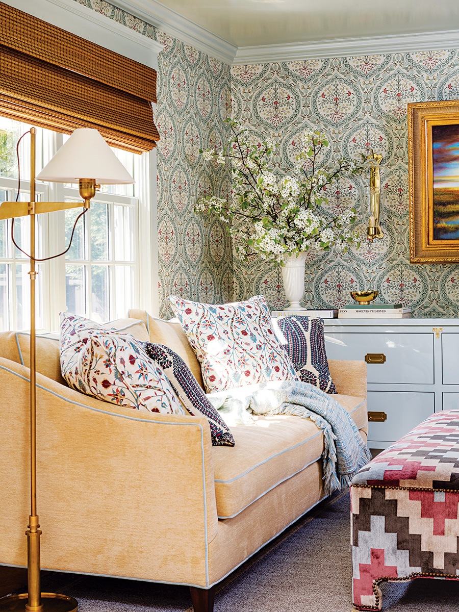
“These are repeat clients, so they understand my methodology, which makes it easier to present such a lively sofa fabric,” Chiappone explains. Although she adores it, Chiappone won’t use it again. “Once I do a fabric, I retire it; it’s for that client only.” / Photo by Greg Premru

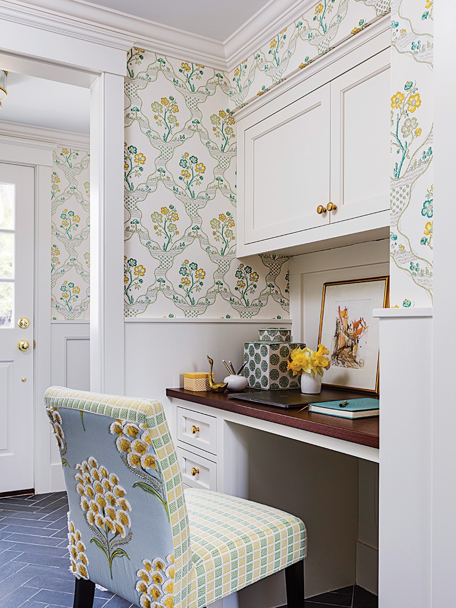
The team tucked a desk for the wife in an alcove in the mudroom, which Chiappone enlivened with the wife’s favorite color: yellow. The starting point was the three-dimensional Schumacher “Aurelia” fabric with satin-stitched blossoms and fringe on the chair back. / Photo by Greg Premru
In the living room, Chiappone went all out with the sofa upholstery: Quadrille’s extravagantly patterned “Les Indiennes” fabric, which she’d wanted to use for years. This client was game. “Our first apartment in the 1970s had a patterned sofa,” the homeowner says. “I loved this material when she showed it to me.”
The statement sofa enlivens the space without emitting a Carnivale vibe. “Light lemon walls and a beige rug provide a neutral foundation, while the solid color lamps, side tables, and grasscloth behind the television strengthen the cohesive base,” Chiappone explains. The stripes, chevron, stylized animal print, and tropical Chinoiserie wallcovering used as accents are all related through color. The palette underscores the leafy view, too. “That true-spring-green fabric on the ottoman reflects the trees in the spring,” the designer says.
In the areas open to the living room, the color palette is softer. The teal Oushak rug under the table provides the punch in the dining room. “Every good room needs contrast,” Chiappone asserts. “Here, it’s a rug that feels established and loved.” As for the jaunty prints on the host chairs and drapery, she says, “Layering with preppy geometrics creates energy.”

In the kitchen, Vaughan pendant lights with pleated fabric shades echo the design of the custom hood, while the Ferran fabric on the stools echo the six-by-six-inch backsplash tiles by Country Floors. / Photo by Greg Premru
The palette is pared back further still in the kitchen, though the use of color is no less effective. “The three blue elements—the backsplash tiles, barstools, and lampshades—keep this white kitchen from feeling monochromatic,” Chiappone says. “They create a compelling vignette without diminishing the impact of the range hood with polished brass strapping.”
The lighthearted blues and lavenders continue up to the primary bedroom, while an autumnal atmosphere is conjured down in the den. The starting point was the Peter Fasano wallcovering, which informed the ochre, rusty red, and chocolate-brown accents. As in the living room, common colors help the patterns play nicely together, as does the varied scale. “The fall hues and large-scale enveloping wallpaper make this secluded space extra cozy for relaxing,” Chiappone says. “Of the rooms I design, my favorites are usually the small, intimate ones.”
Architect
Patrick Ahearn Architect
Builder
Whitla Brothers Builders
Interior Designer
Digs Design Company

The den, just off the living room, was designed with an eye toward aging in place. Its size can accommodate a king-size bed, the custom built-in can work as clothing storage, and there’s a new full bath nearby. / Photo by Greg Premru
First published in the print edition of Boston Home’s Spring 2024 issue, with the headline “Seasonal Splendor.”


