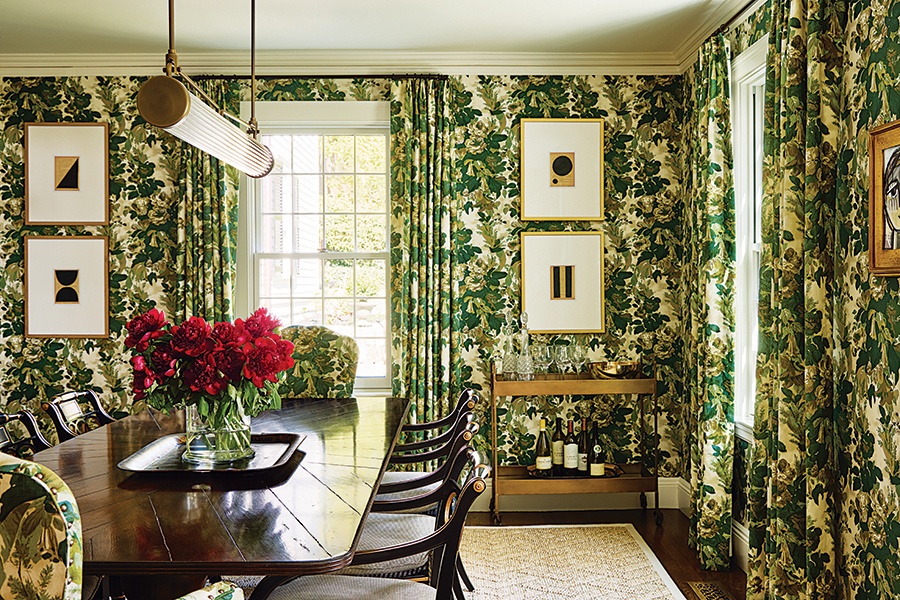
A Dining Room That Makes a Statement
The perfect holiday gathering starts with a daringly designed dining space.

Contractor: The Chelsea Company. Interior Designer: Katie Rosenfeld & Co. Styling by Karin Lidbeck-Brent. / Photo by Read McKendree
The Problem
The owner of this 1930s home in Wellesley—designed by pioneering architect Royal Barry Wills—initially preferred a neutral palette for her redesign. But after consulting with interior designer Katie Rosenfeld, she realized that she wanted her dining room to be more than the “plain white box” it was, says Rosenfeld, who convinced her client to explore color and pattern.
The Solution
Playing off her client’s affinity for green, Rosenfeld swathed the room in Michael S. Smith’s verdant “Grace” pattern. Using the same motif for a room’s wallcovering, window treatment, and upholstery is a very old-fashioned concept, explains Rosenfeld, noting that it’s also an easy way to decorate. In this case, though, “We were going for classic with a little edge.” The pattern achieves cohesion in the space while serving as a backdrop for some more modern elements, including the linear, unlacquered brass Urban Electric Co. chandelier. The custom-made dining table, meanwhile, pairs perfectly with black Regency side chairs uncovered at a consignment shop. “The dining room is now the statement room of the house,” Rosenfeld says—which is exactly the way it should be. “You wouldn’t want to do this in a family room or a huge room. A formal dining room isn’t used often, so it’s a place where you can create an experience; a space that can have a moment like this.”


