This MBTA Map Tells You Which Are the Cheapest T Stops to Live By
Looking to move apartments? Listen up.
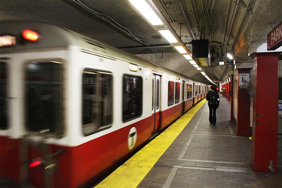
Photo by Margaret Burdge
We all know the typical tricks for knocking a few dollars off our rents: Bunk up with roommates, go for a place that hasn’t seen a renovation in a decade or two, or treasure hunt during the winter in hopes of off-season discounts. But how often do we stop to consider how much the T stop we commute from is dictating our monthly housing costs—and whether we could save some money just by moving closer to the next stop on the line? Rental search engine RentHop has released their annual report of a different kind of MBTA map—one that shows average rent prices along the Red, Green, Orange, and Blues lines. And if you’re looking to move apartments, you’d better listen up.
Across the subway, rents increased by 3.6% from 2019 to 2020. They went up at 88 MBTA stops, decreased at 27 stops, and stayed the same at just six. To calculate the percent changes, data scientists at RentHop pulled year over year data for one-bedroom apartments between the months of October and January. Then, to tally up the averages in each zone, they culled non-duplicated one-bedroom listings within a radius of up to 1.2 miles of each stop to get information on at least 50 unique apartments, and then honed in on the median.
So, are you getting a shakedown or a deal in your current digs? For those living by Heath Street, the average has gone up a wallet-squeezing 14.6% in the past year, bringing the total up to $2,350—though the report points out that the trendy new apartments at 201 South Huntington Ave. were a big reason for that rise. Rents also skyrocketed around the Boston University East, Boston University Central, and Fenway stations by 8-10%, in part due to the 20-plus additional one-bedrooms at 839 Beacon Street.
As for some of the stations that became a little cheaper in the last year (good places to look right now) median one-bed rents around Eliot on the D train and Prudential on the E train both feel by more than 6%. Prices in the vicinity of Roxbury Crossing, Longwood Medical Area, and Brigham Circle also all decreased by about 4%, suggesting it’s worth carefully looking in the Longwood and Lower Roxbury area.
Of course, the closer you live to the center of the city, the higher the price you pay for that convenience. As the four lines approach downtown, most of them feature rents in the $3,000 range for a one-bedroom unit. Creep down each track, though, and you’ll see dollars slide to the mid-to-high $1,000s and low $2,000s by the end of the line.
But since most of us aren’t looking to add another hour to our commutes, there are faster ways to lower your rent budget. RentHop highlighted a few comparisons where a short relocation could “turn your commute into extra cash”: Save $1,247 if you move from Aquarium, where the median rent is $3,397, to Maverick, where the average is $2,150; there’s a $1,100 difference between Back Bay ($3,600) and Massachusetts Ave. ($2,500); and you could pocket $900 if you considered lodging around Andrew ($2,400) instead of Broadway ($3,300).
Just zoom into your stop on the map below and compare prices with the stations right around it. The Green Line’s Harvard Avenue stop, for example, holds an average of $1,950 per month—but go up or down one stop and that falls by $50. And if you take your search four stops up to Washington Street, you could put $100 back in your wallet, and have a much better shot at snagging a seat on the train.