Re-Formed for the Future
When a new sculptural stairwell replaces a space-consuming relic, an 1892 row house in the South End is readied for its next century.

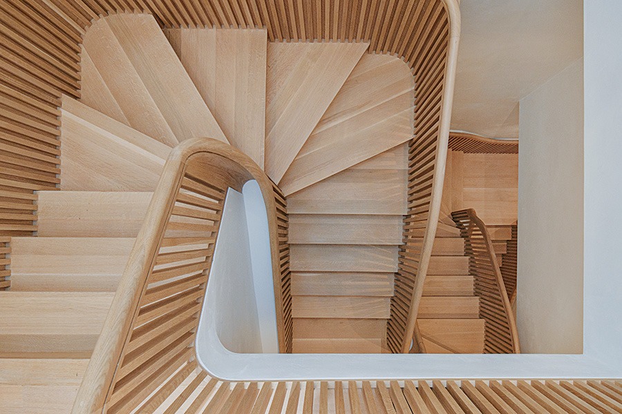
Handcrafted from white oak and installed in segments, this sensual staircase undulates like a switchback throughout the historic home. / Photo by James Leng
Imagine ascending a steep mountain slope. You traverse side to side across the pitch in a switchback fashion, turning almost 180 degrees at the edge to continue up. This type of turn is referred to in the lexicon as a “hairpin turn,” named for its resemblance to a metal bobby pin. It inspired the renovation of this historic brick residence—aptly coined Hairpin House by the design team—most notably a romantic central stair that unfurls like Christmas ribbon through four stories.
The homeowner enlisted Boston architecture firm J. Jih Studio and San Francisco’s Figure to modernize and reorganize the floor plan and inject it with luminescence. The team needed to accommodate the South End’s strict building code and was limited by a 15-foot-wide footprint and original staircase that dominated 30 percent of the 19th-century home.
Unraveling from the top floor to the basement, the original staircase bifurcated the building, consumed a third of the home, and divided it into awkward living arrangements, forcing all of the rooms to be uniform in size. To fix this, Jih says they reclaimed the building’s natural topography and increased the square footage by 20 percent by enlarging primary spaces, including the living room and bedrooms, and decreasing secondary spaces, like bathrooms and the foyer.

Lime plaster, a binding agent used in construction for centuries, gave the exterior brick façade a modern appeal while respecting the home’s legacy. It also provided breathability, moisture diffusion, and textural depth. / Photo by James Leng

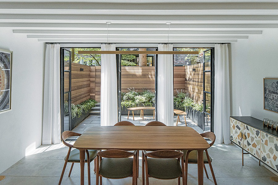
Floor-to-ceiling windows with verdant views allow light to flood the new living room. / Photo by James Leng
“These qualities made the living configuration rather peculiar. The first thing we did was try to make all the rooms grow or shrink to their desired sizes,” Jih says. “What happened was, as these rooms swelled or shrank, they started to kick and punch the stair because the stair didn’t want to be a vertical shaft anymore. So we organized these rooms as a stack that produced an oblique shift between them.”
This metamorphosis allowed a new white-oak staircase—fabricated off-site in one-story segments—to shine as a showpiece of craftsmanship and design. Cascading diagonally while naturally clinging to the rooms’ geometry like a mountain switchback, it creates a 40-foot atrium that is at once sensual and puritan. Tightly arranged balusters and a sinuous, rounded handrail produce a sculptural figure and vertiginous space within a highly constrained site, Jih says. This curvature also appears throughout the home, including the undulating kitchen island and the rounded living room furnishings.
“We really felt that it was quite important for everything to feel incredibly tactile and sensuous,” says Jih, who strove to design smooth surfaces that felt pleasant to run one’s hand along when walking by. Since all of the home’s spaces are close together, it was key that they feel continuous and intimately linked. This is evident in the stair’s white oak and the travertine kitchen counters, which softly diffuse light with their low-gloss finish.

The kitchen is a warm, neutral space that opens to the patio with curvilinear furnishings that mimic the staircase. / Photo by James Leng

The new staircase unwinds like a hairpin curve and inspired the home’s affectionate nickname, Hairpin House. / Photo by James Leng
The exterior brickwork also welcomed that sense of tangibility with a refresh. Jih says the brick façades were in “varying degrees of awful” because the building is more than 130 years old. Applying a lime plaster to the bricks added a modern approachability with humidity- and noise-absorbing capabilities, which “gives a bit of depth within the surface visually,” Jih says. Since lime is an old material that has been used since the 16th century as a binding agent in construction, “it very nicely bridges between the preserved surfaces and the new surfaces.”
An entirely new rear façade—including steel framing and new floor-to-ceiling French doors and windows that lead from the kitchen to the patio garden—welcomes additional light and amplifies the home’s multi-sensory composition. Meanwhile, a neutral palette dances through the home and invites security in each moment. “We wanted to choreograph this sequence of light material and experience throughout the house,” Jih says, “so that this parallels that experience of ascension.”

A refreshed rear façade with a wall of French glass doors allows the kitchen and updated patio garden to unite into one large, welcoming space. / Photo by James Leng

The kitchen—and its travertine island—exemplifies the home’s neutral palette while inviting conversation and relaxation. / Photo by James Leng
First published in the print edition of Boston Home’s Fall 2023 issue, with the headline, “Re-Formed for the Future.”


